Marty's Parts
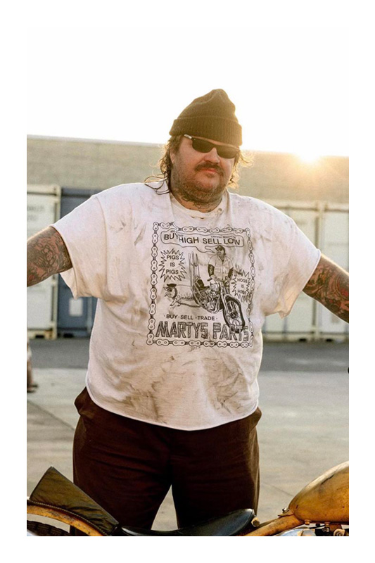
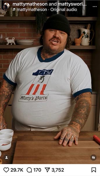
Marty was a biker who used to unload his vintage motorcycle parts on Instagram at a loss. I heard he got a side gig as a chef or an actor or a producer or something and I never heard from him again.
I wonder what happened to him?
Guess we'll never know.
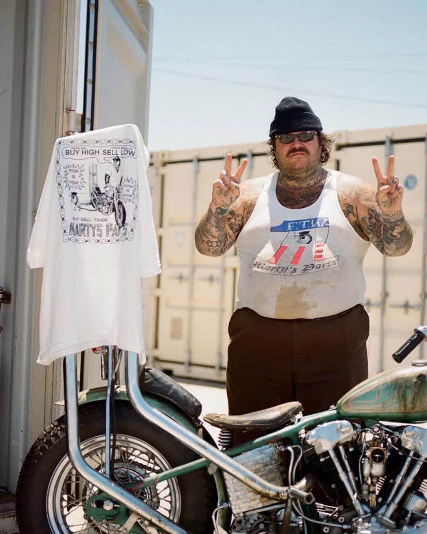
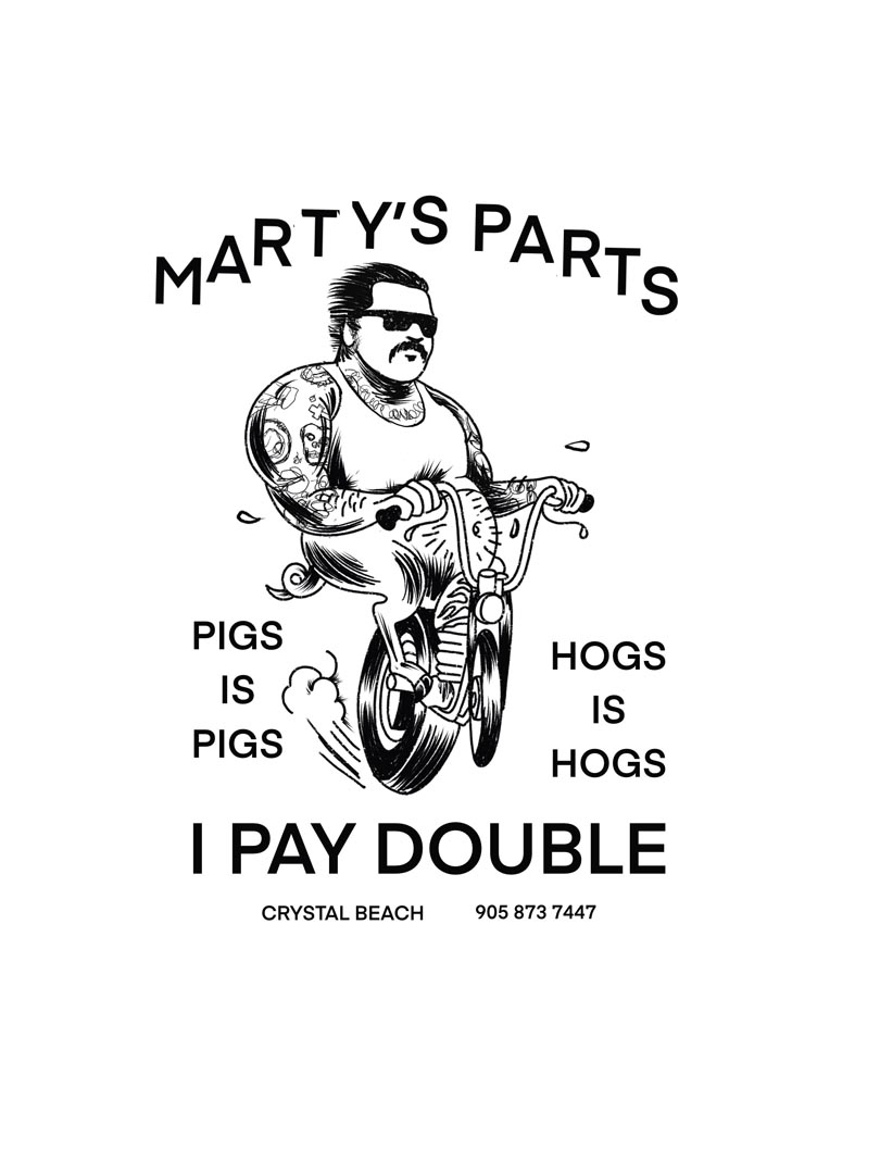
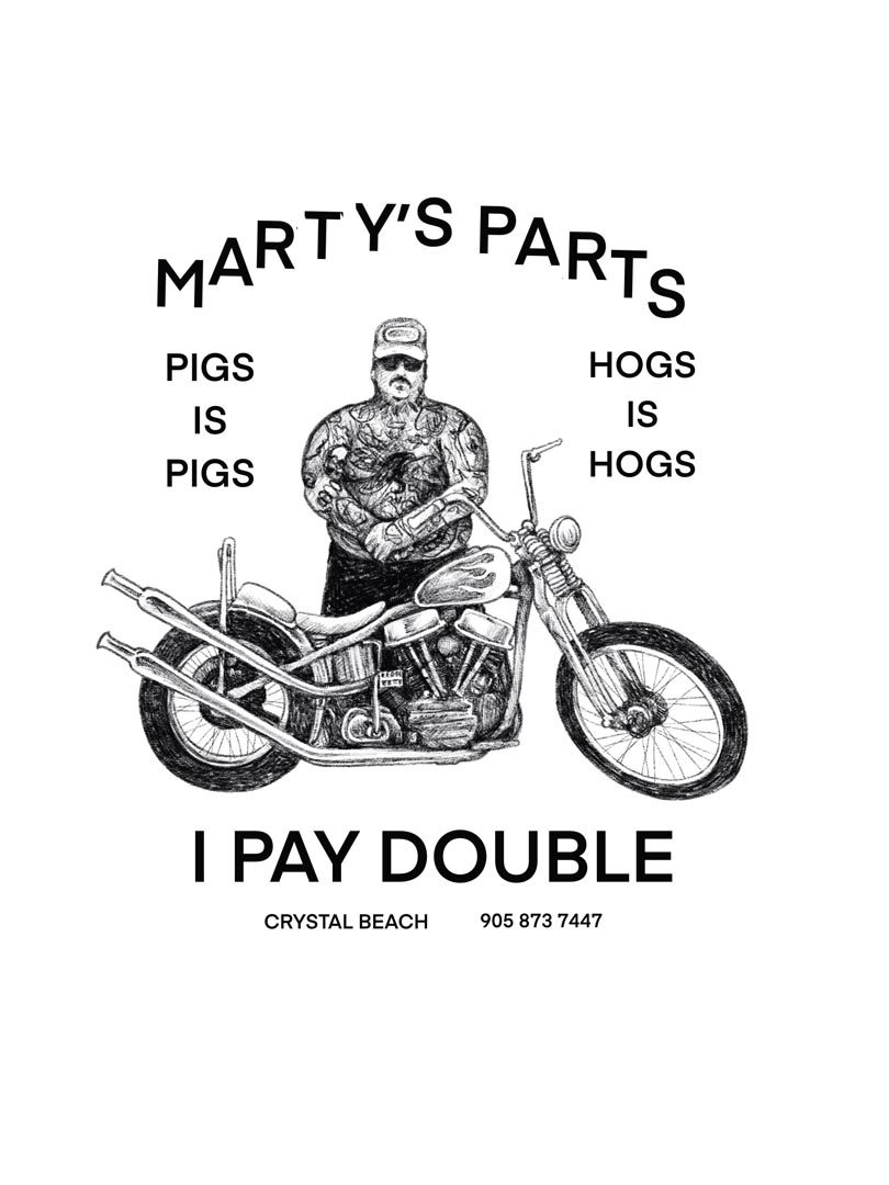
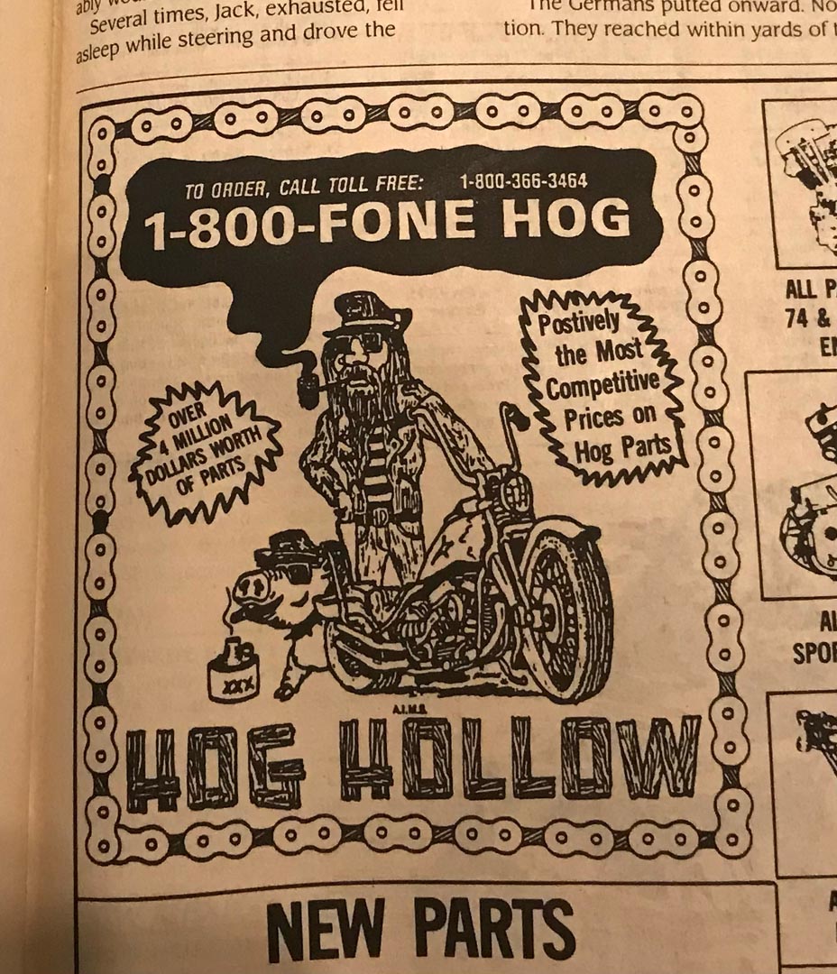
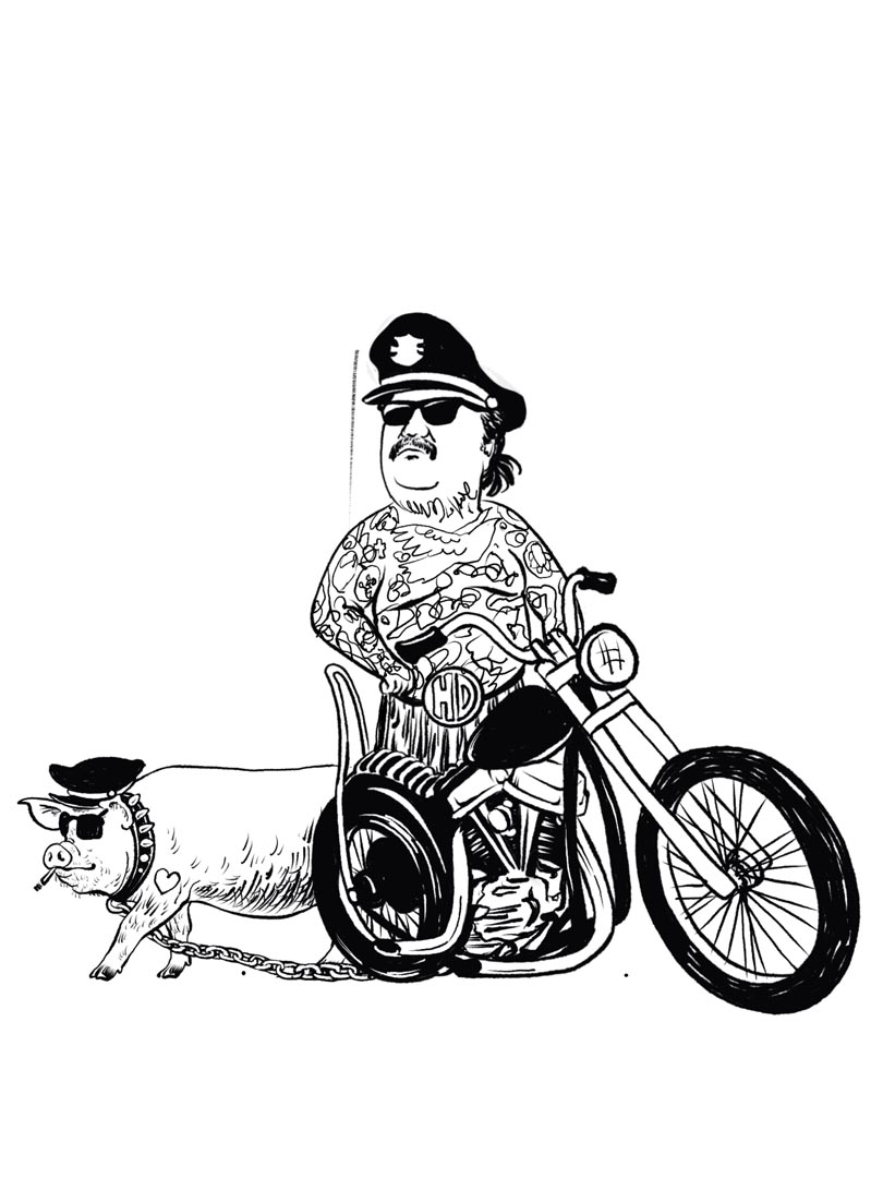
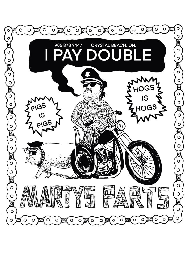
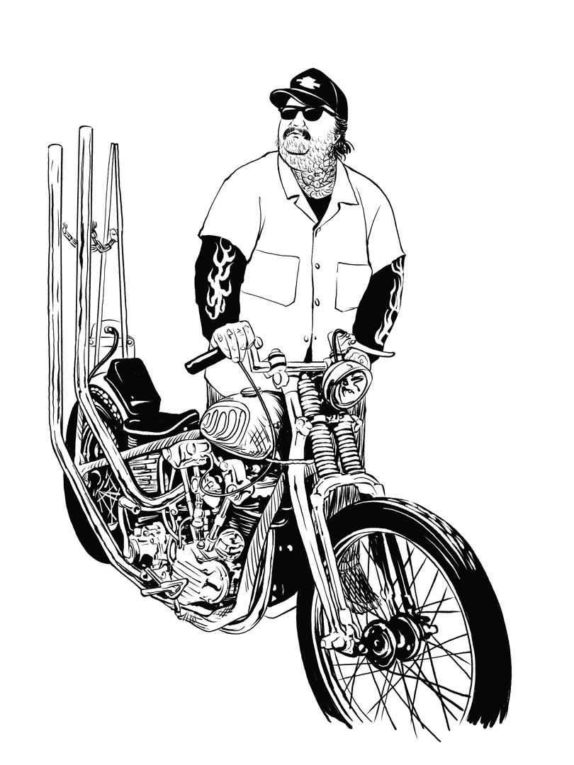
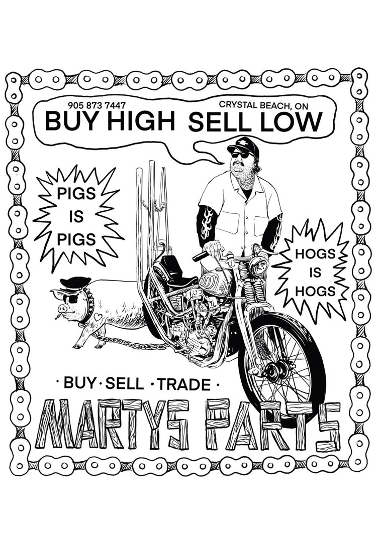
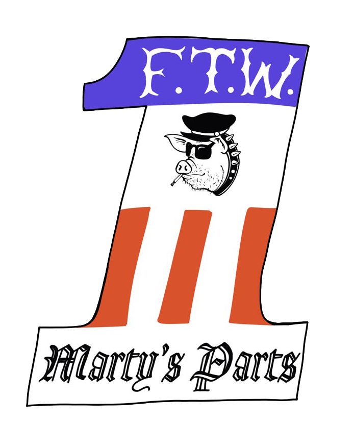
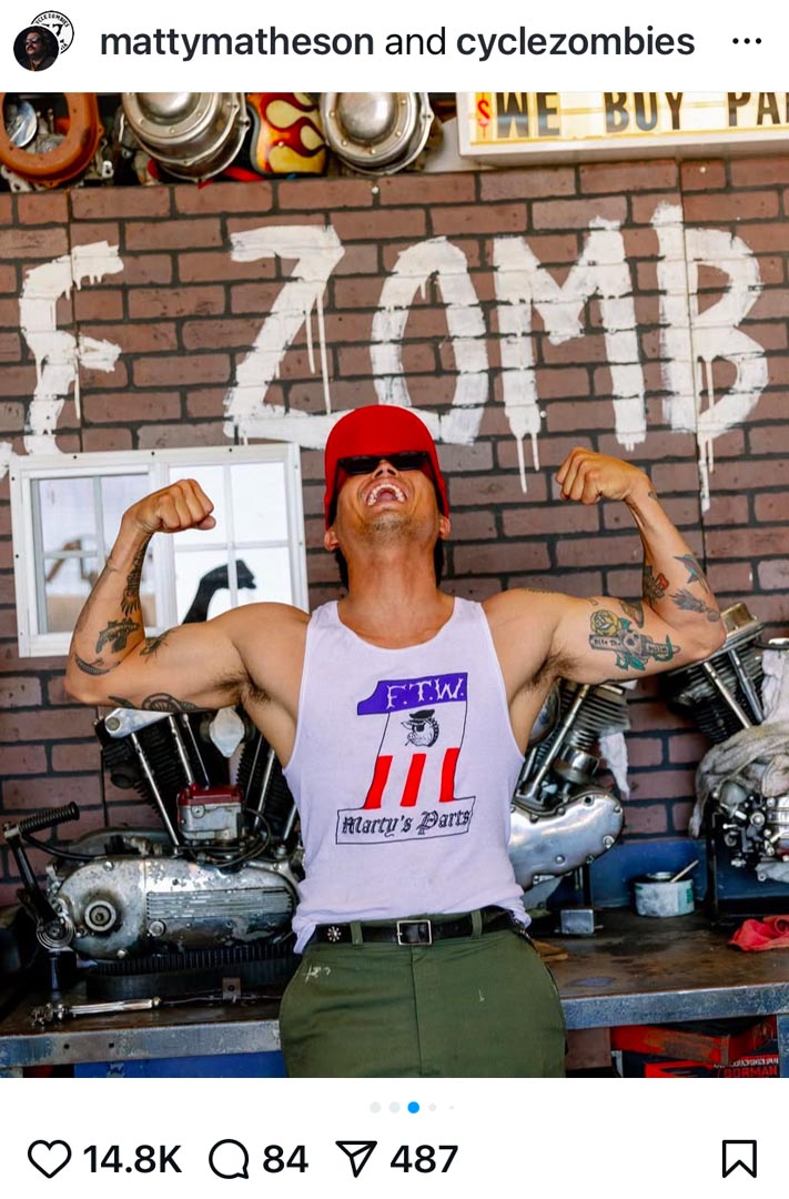
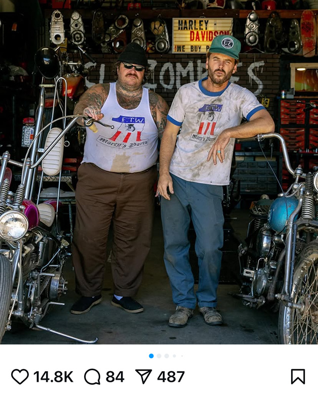
In all seriousness, Matty and I share a love of old motorcycles and biker mythology. When he started his used parts side hustle Marty's Parts I was happy to help define its visual identity. This image pays homage both to the early Harley racing team number plates, and a notorious motorcycle club, who are known to be rather protective of their IP, so care was taken to make the changes required to stay out of trouble.
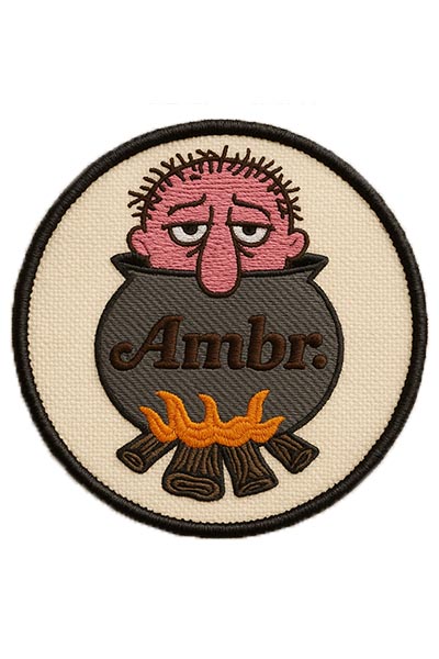
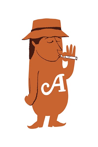
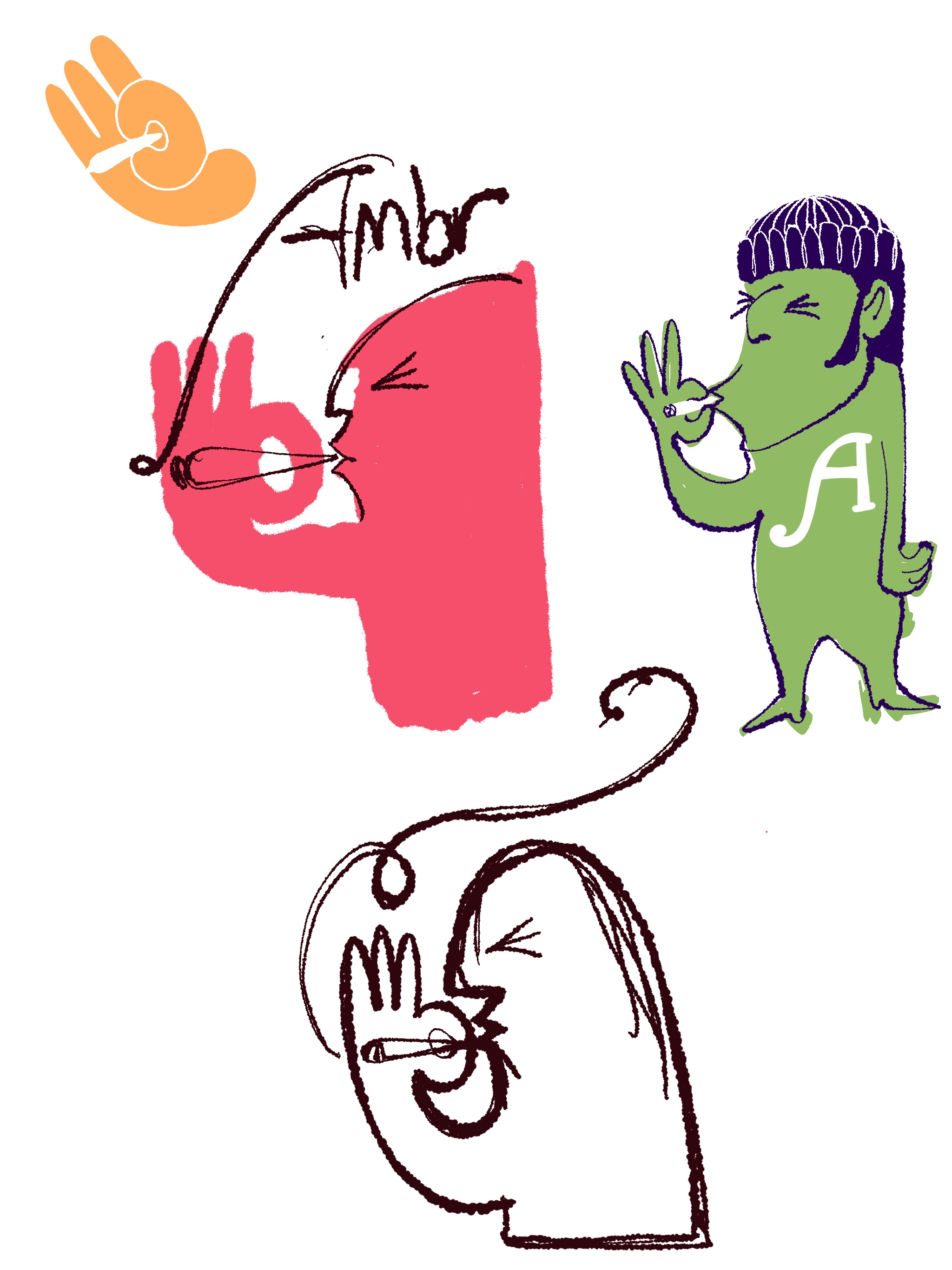
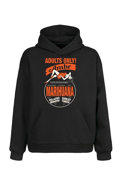
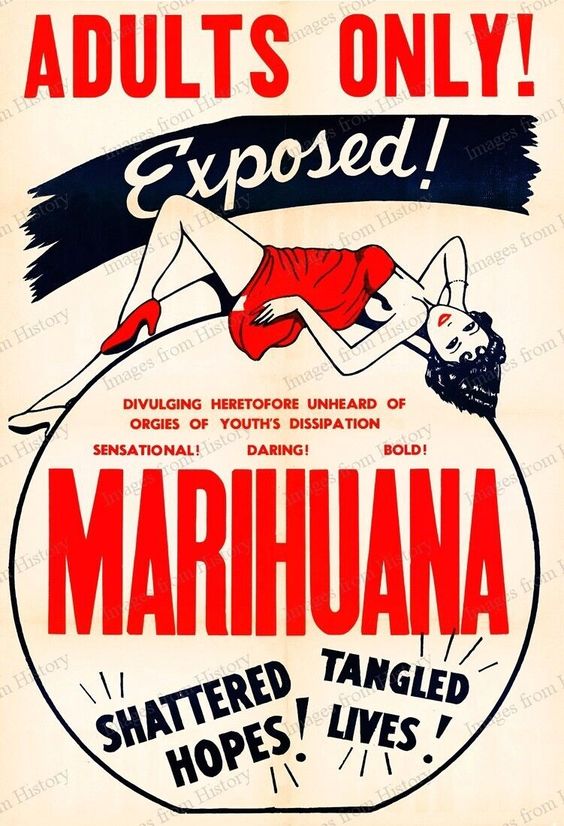
Ambr Cannabis
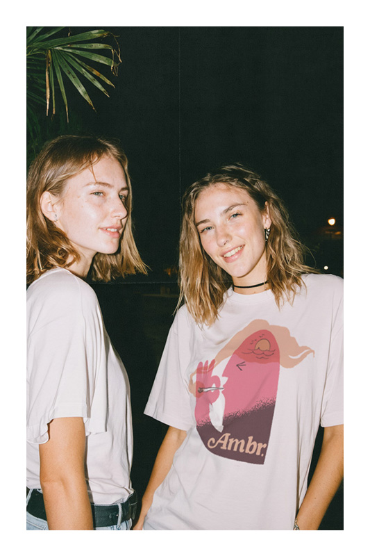
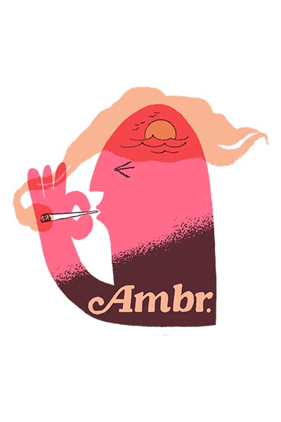
Ambr Cannabis initially approached me to create some merchandise based off posters from youth-panic movies like Reefer Madness and Marihuana!. After some discussion we managed to land on designs that were more aligned with their current branding, which features retro 70's swash fonts and fun colours.
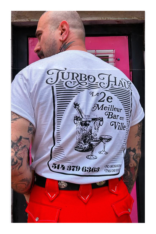
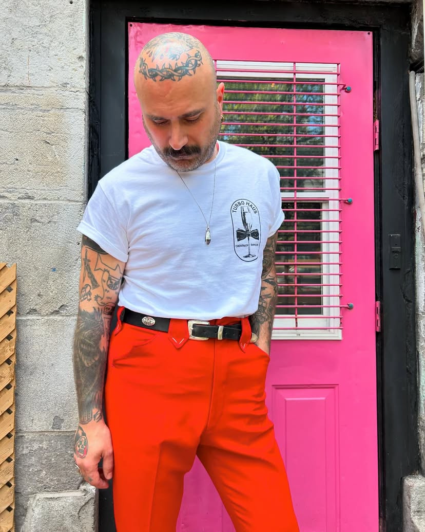
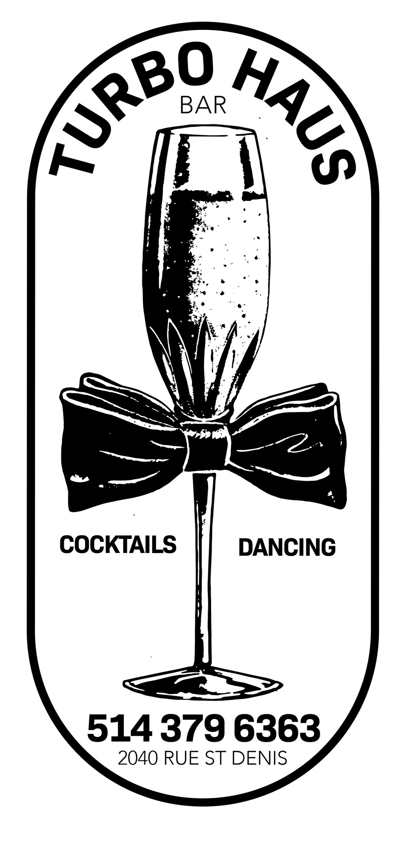
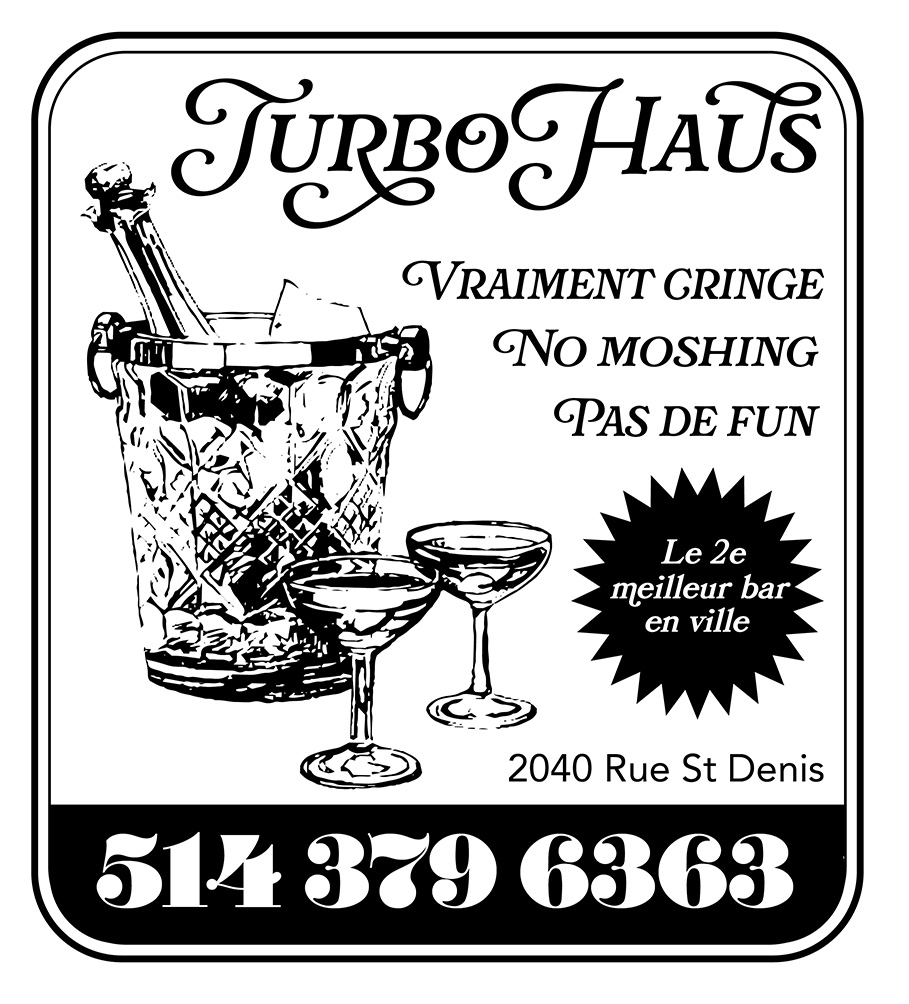
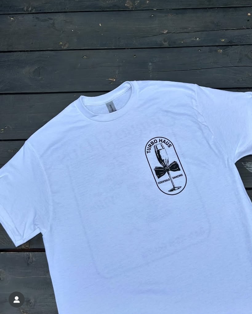
Turbo Haus
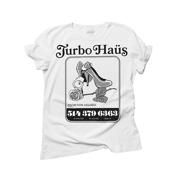
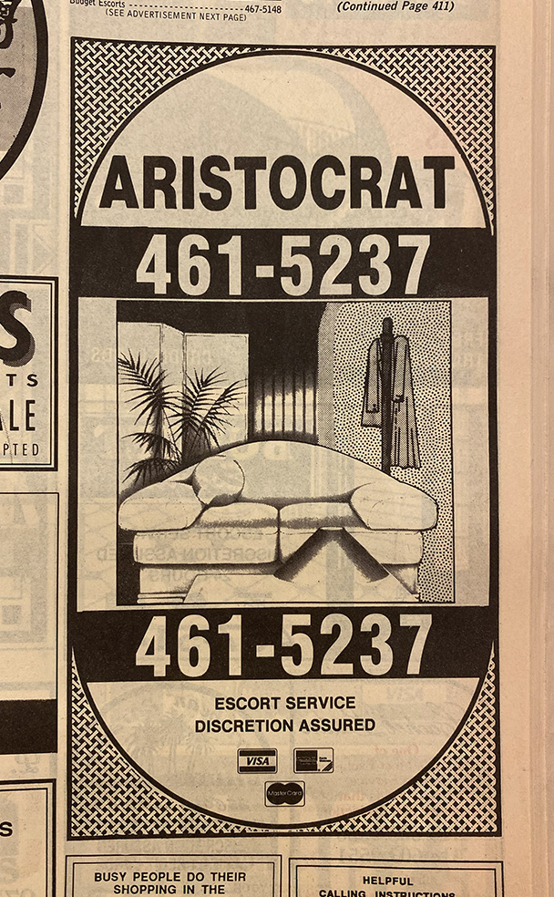
The first design that Turbo Haus approved was met with a criticism from a group of sex-workers in Montreal. They felt that it was in poor taste to use language and imagery associated with their trade to promote a bar that had nothing to do with them, especially at a time where they face arrest for using the exact same imagery and language to promote themselves. I was happy to change the design at the last minute before it went into production, and in the end all parties were satisfied. I offered pro-bono design services for some of the sex-workers in an attempt to extend the olive branch but so-far, no takers.
Sacred Athletics
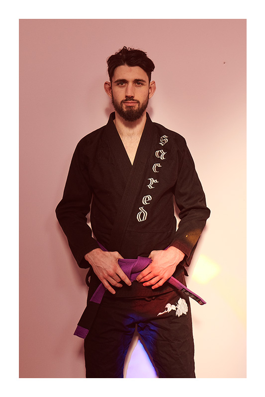
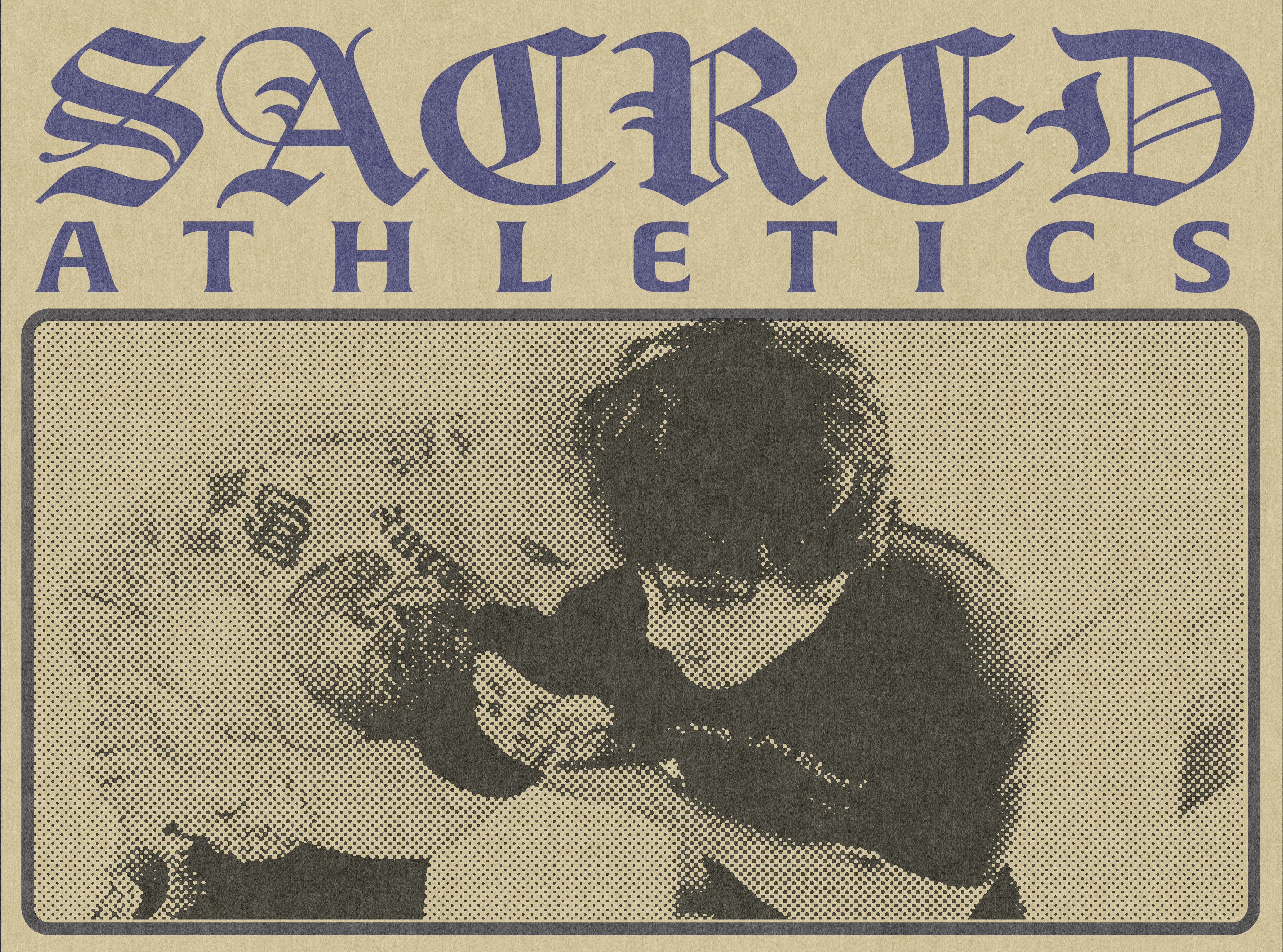
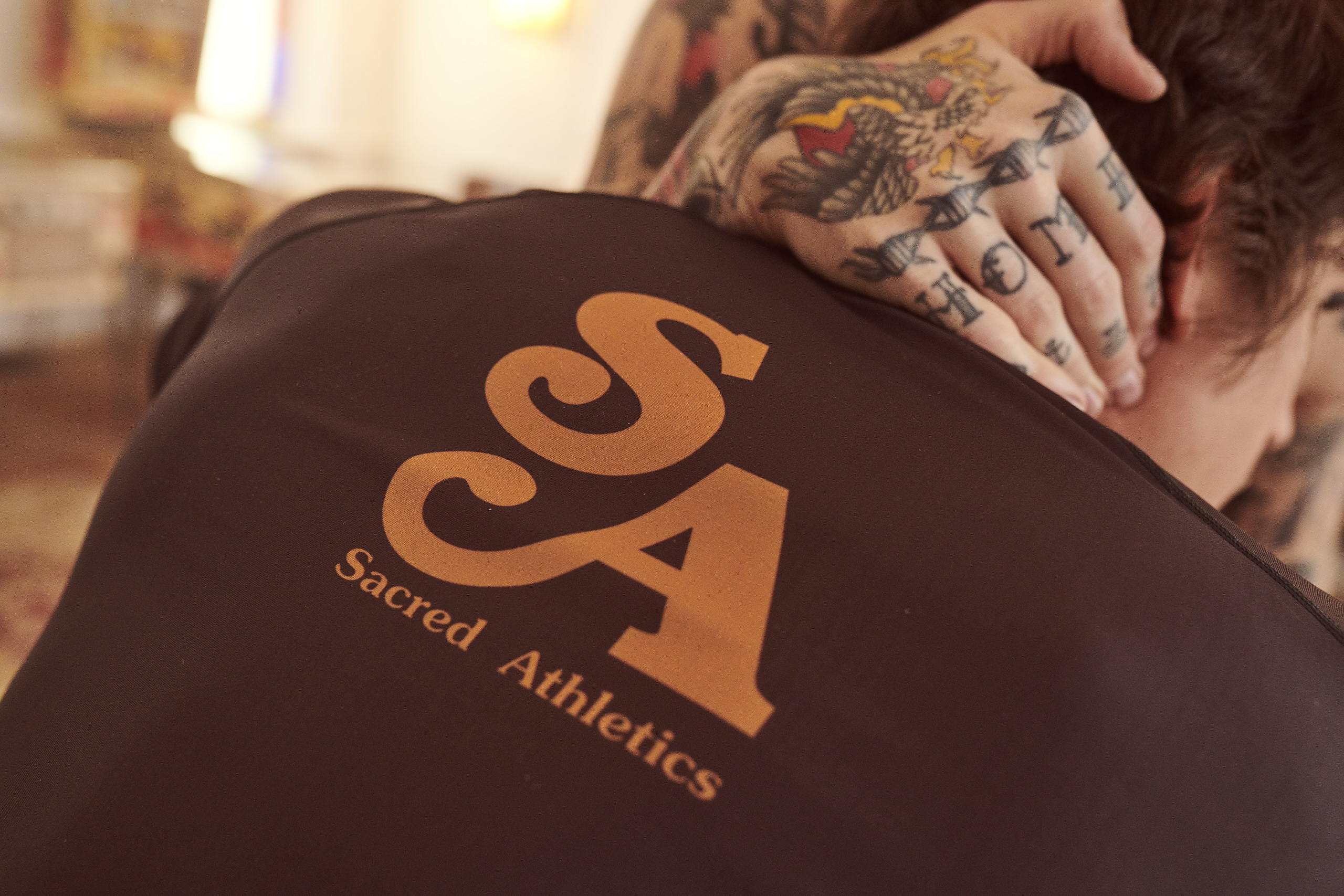
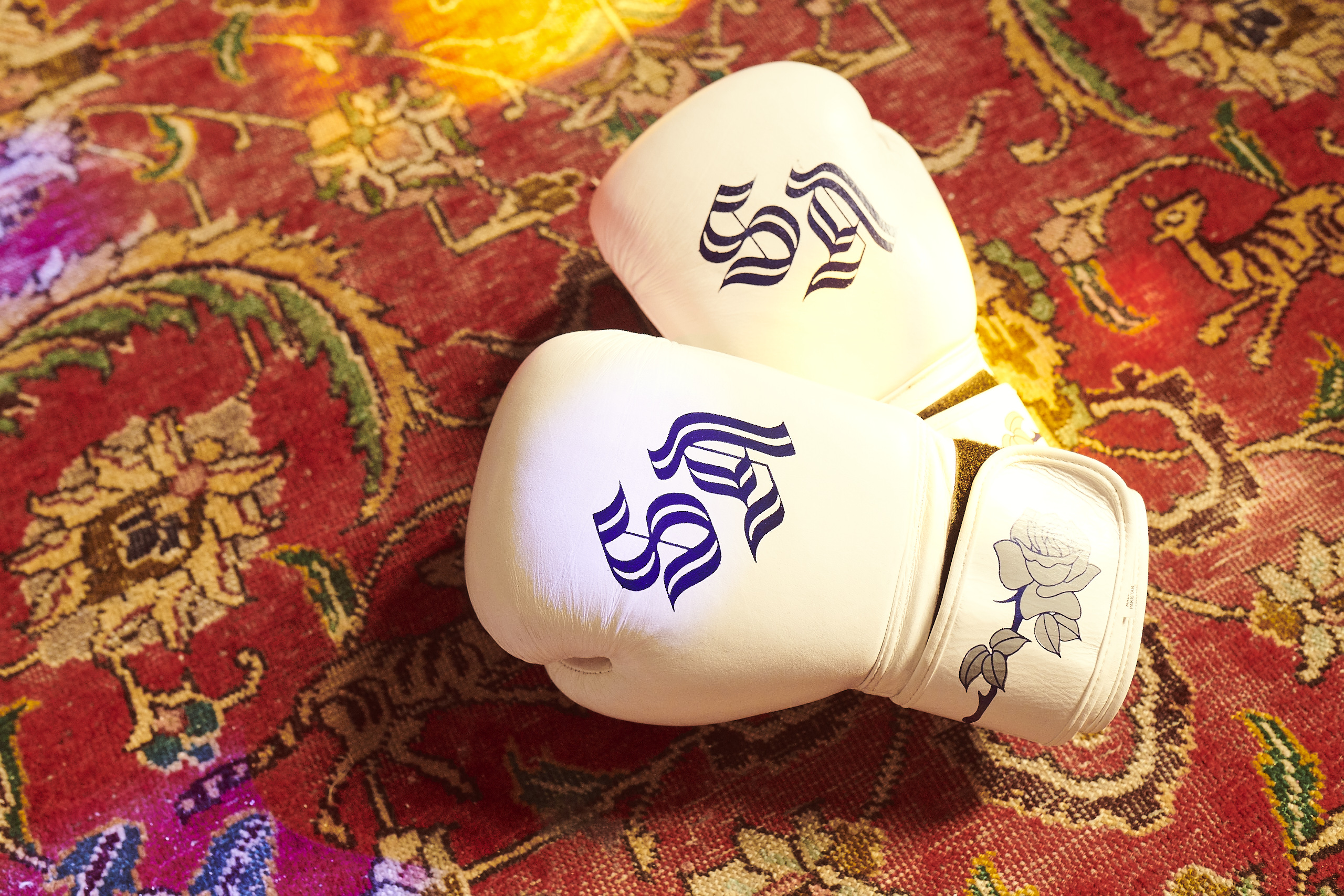
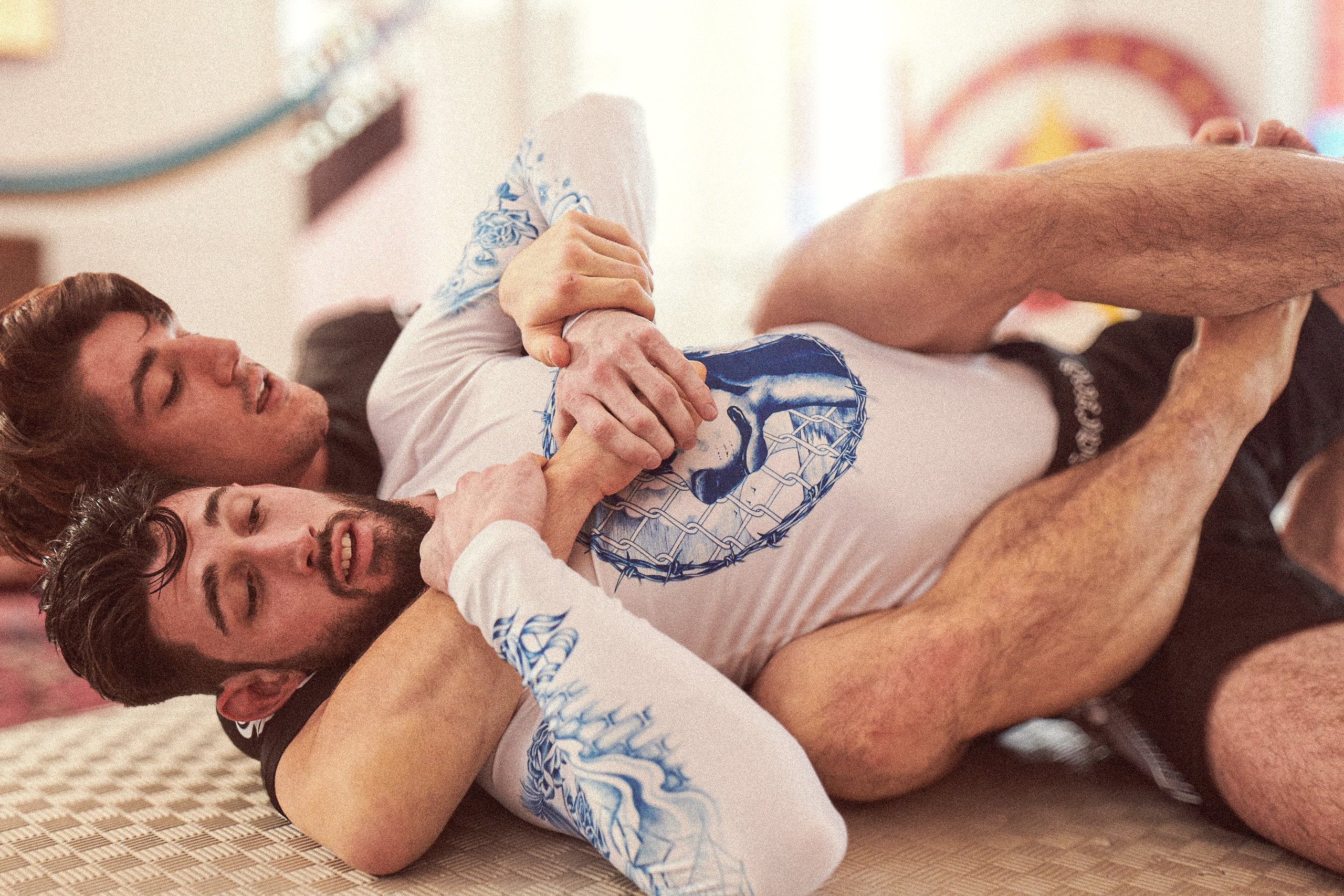
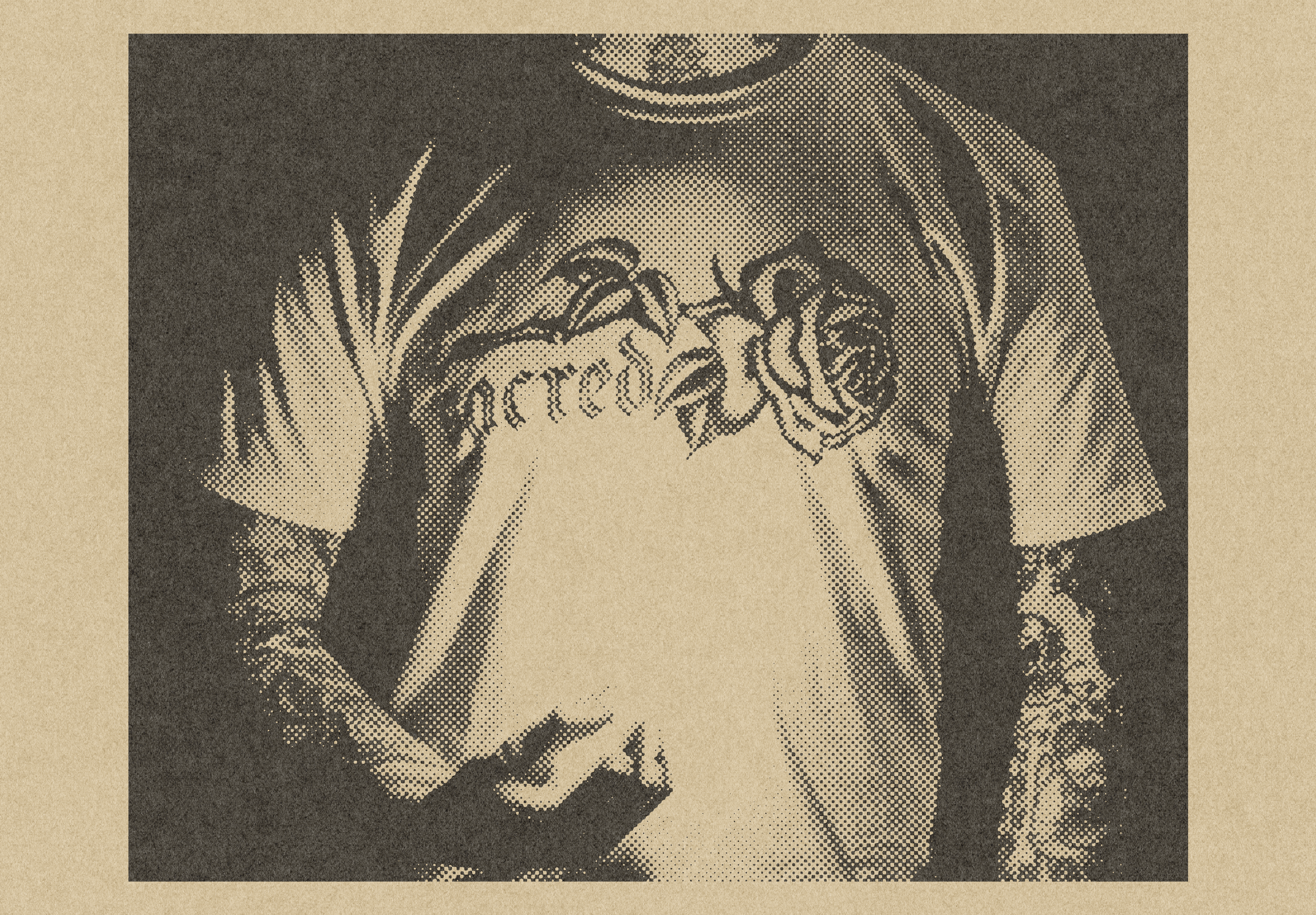
Brazillian Jiu Jiujitsu has a problem. It's a lifestyle masquerading as a sport, which creates a unique challenge. Does a fledgling apparel brand look to athlete sponsorships to build credibility in a community where, famously, hardly anyone watches competitions? Does a gold medal around the neck of a competitor mean anything to a world of practitioners who are more interested in the journey than the destination? Sacred Athletics looks to solve this problem by creating a lifestyle brand that is rooted in the sport, but not defined by it. If other brands were in the gym lifting weights, Sacred was in the parking lot trying to land a heel-flip. While other brands chased the podium, Sacred Athletics chased the culture.
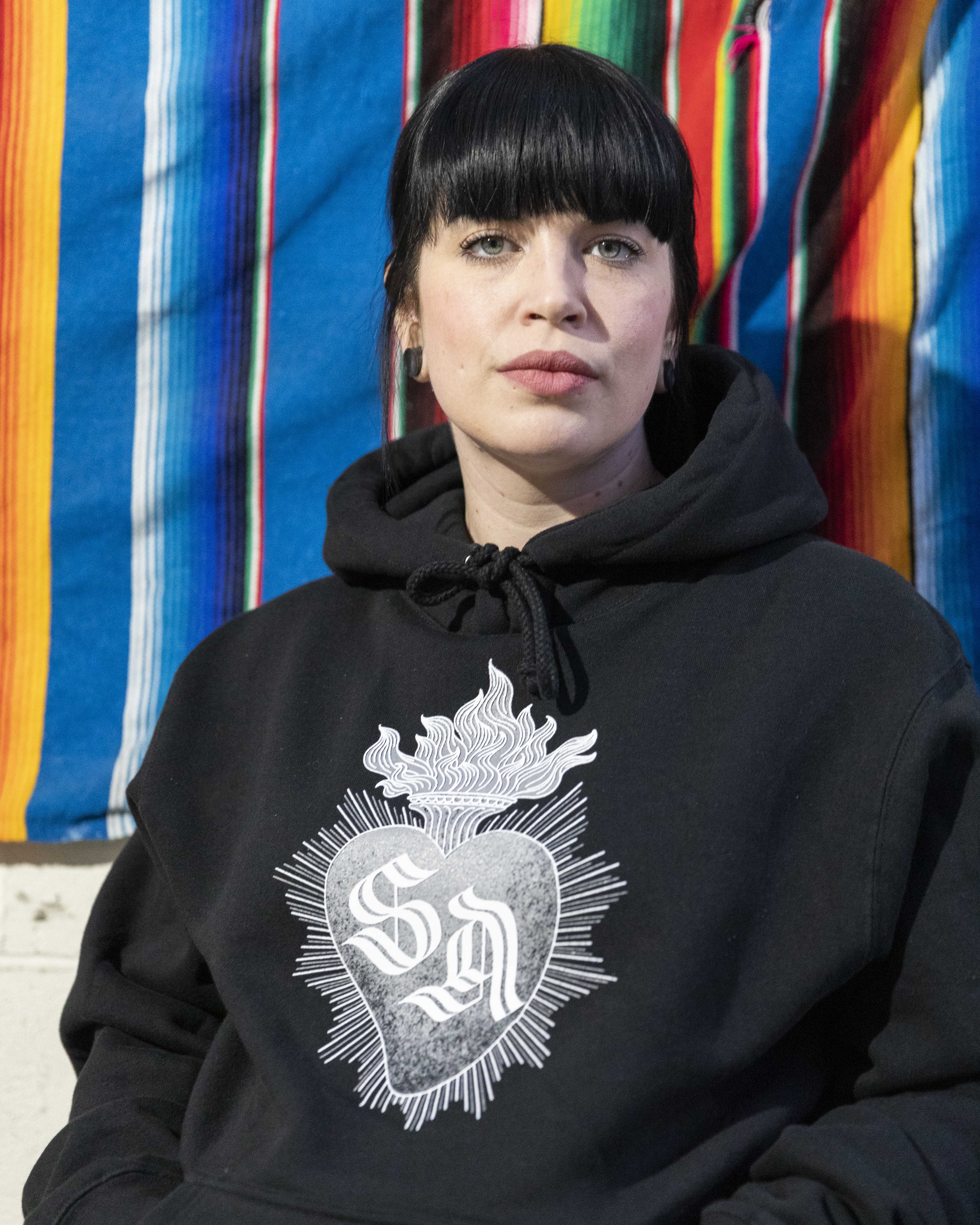
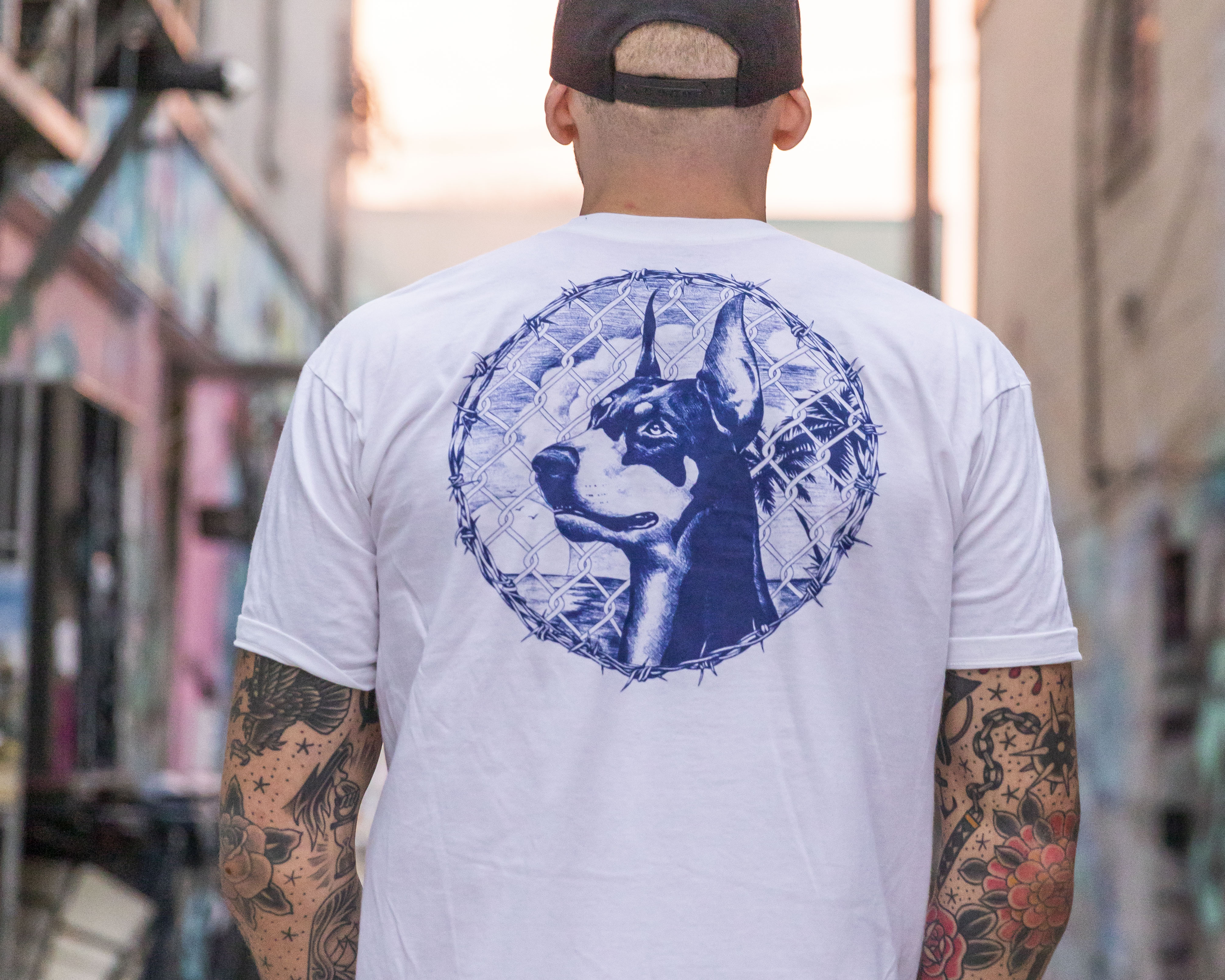
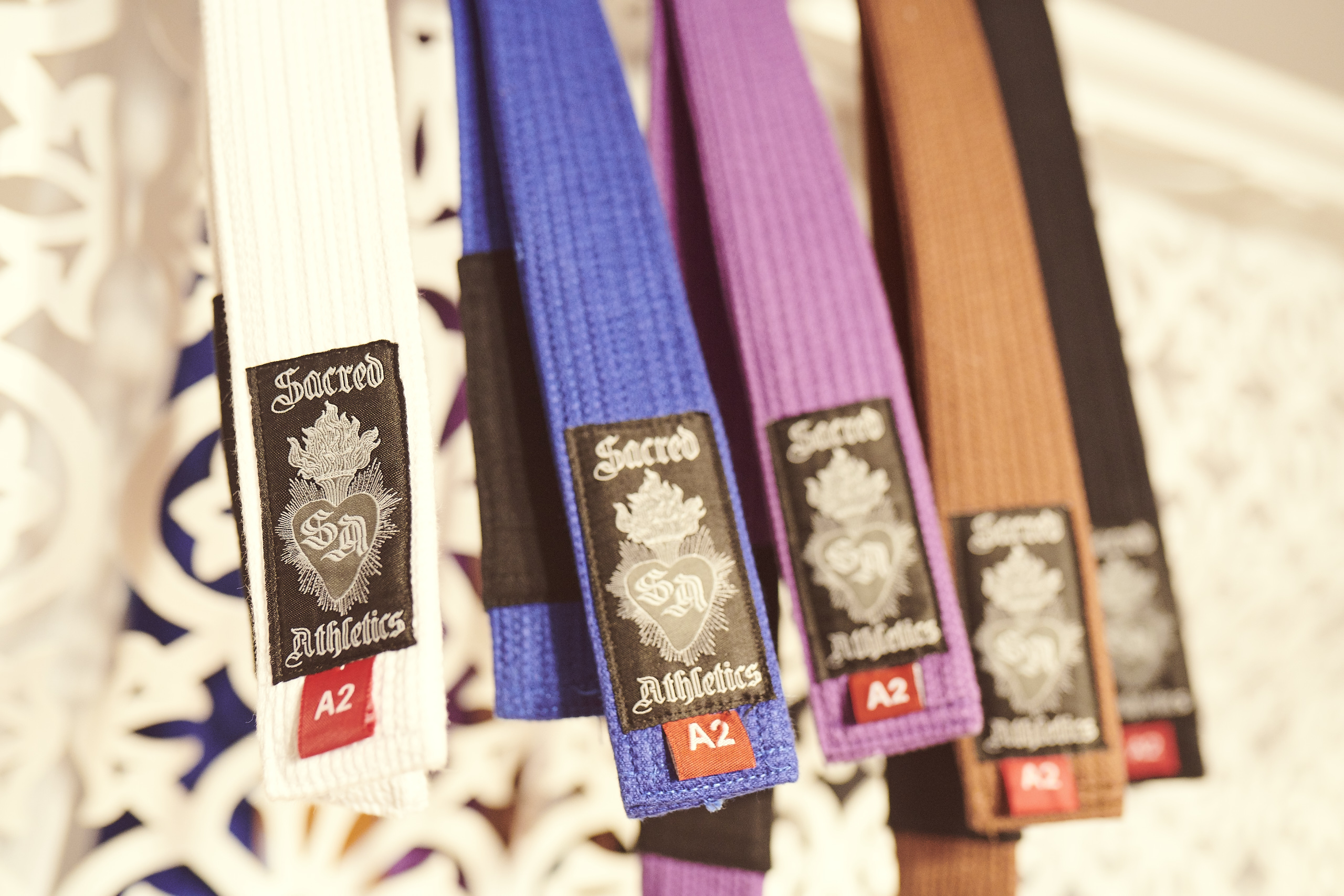
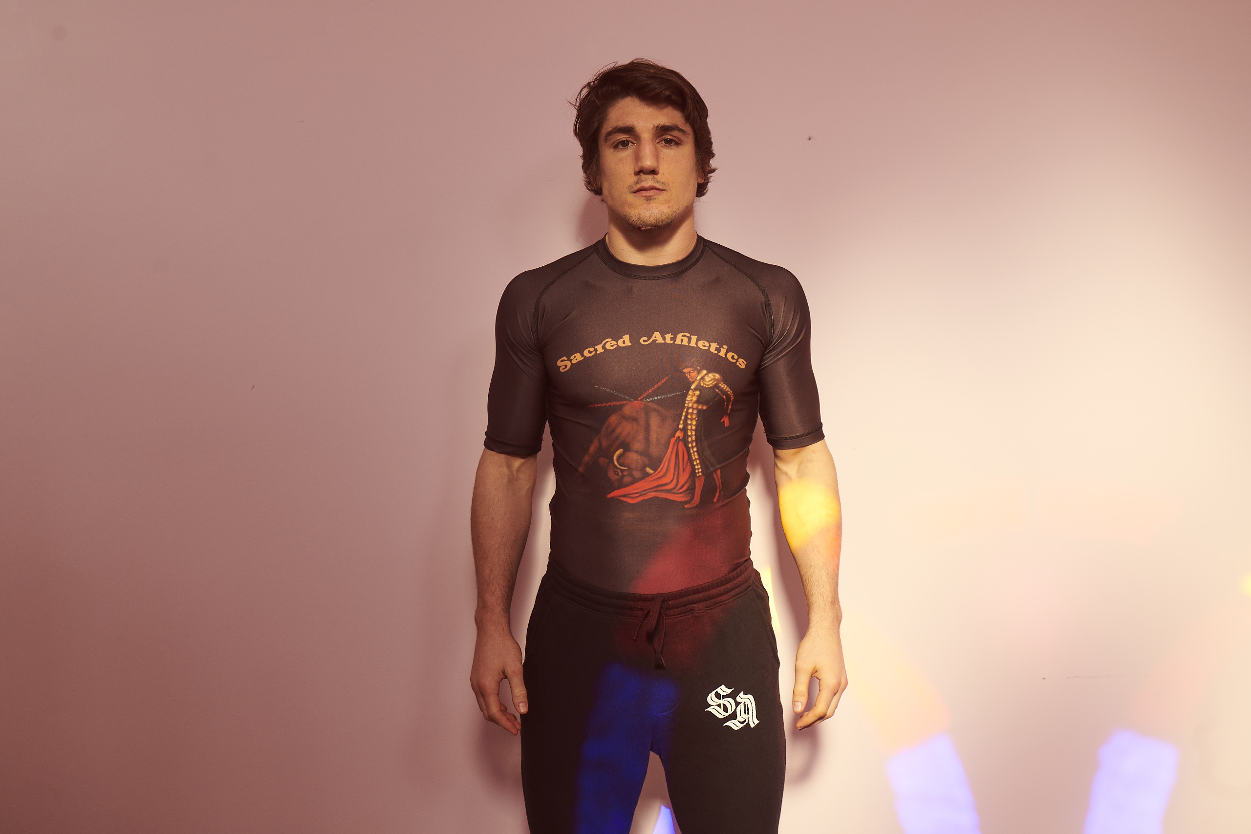
I was brought in early to define the brands identity and visual language. They were interested in my background as a tattooer and a punk and were hoping to impart some of that feeling from the beginning. I was involved directly in the prototyping process, communicating regularly with the manufacturers in Pakistan, as well as directing the photo-shoots and pulling together pitch decks for the early funding rounds. Sadly covid hit as the project was gaining momentum and sunk it before it could get off the ground.
Lyle's
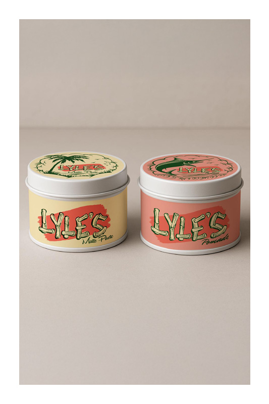
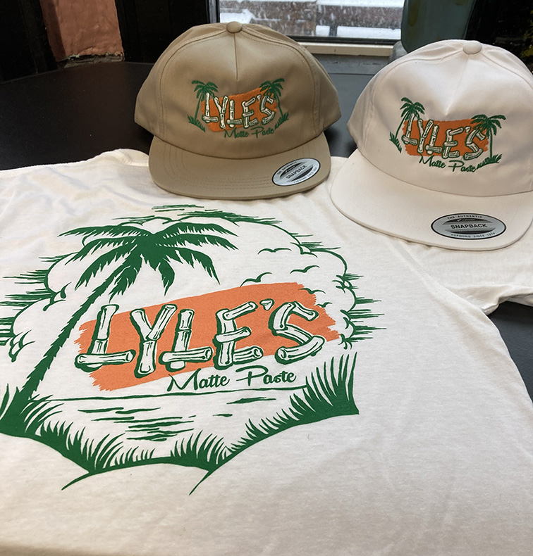
Lyle's is the in-house pomade brand for the Crows Nest Barbershop. Initially they asked me to create a label that leaned heavily on tattoo imagery, but I felt that the Crows Nest as a brand has a unique mid-century tropical vibe, and it would be a shame not to develop it further. "Think more The Birdcage and less Ed Hardy belt buckle". The initial run of the matte paste sold out quickly and I designed a second label for the pomade. There has been discussion of adding a 3rd flavour in the future.
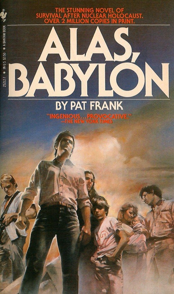
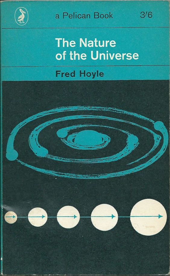
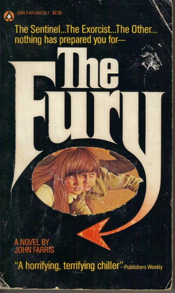
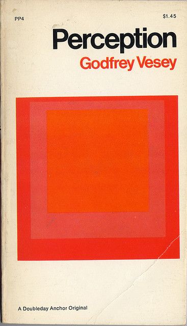
Typography Specimen
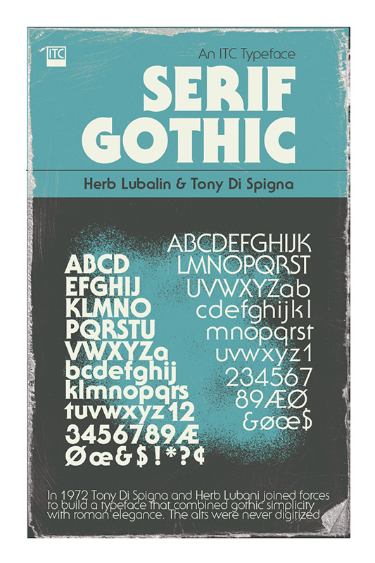
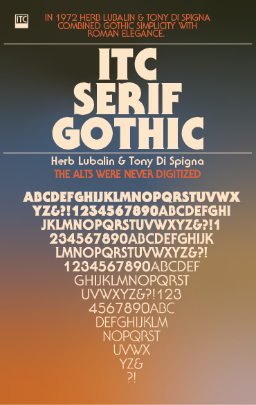
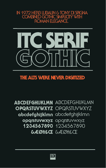
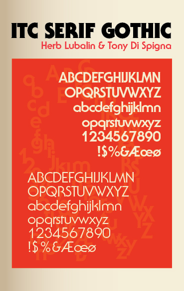
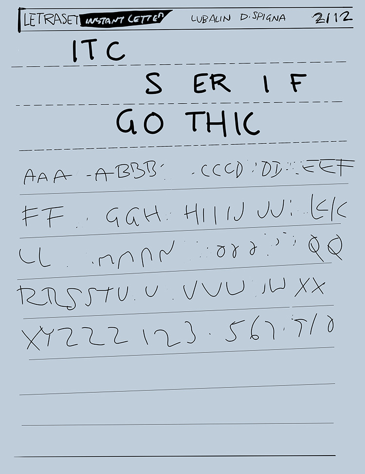
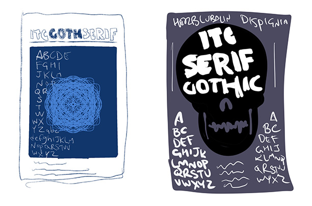
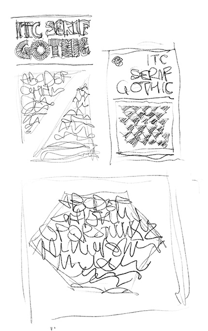
I come from a family of artists. Both of my parents took part in the proud tradition of dropping out of OCADU (just OCA back then). The result was growing up in a home with abundant art supplies and all the other curiosities that comes from art supply stores. I have a few vintage copies of airbrush action magazine from back then as well as my prized 1982 Letraset catalogue. The opportunity to take typography at Humber was a real pleasure, because it meant taking the time to investigate some of the typefaces I'd been familiar with for years.
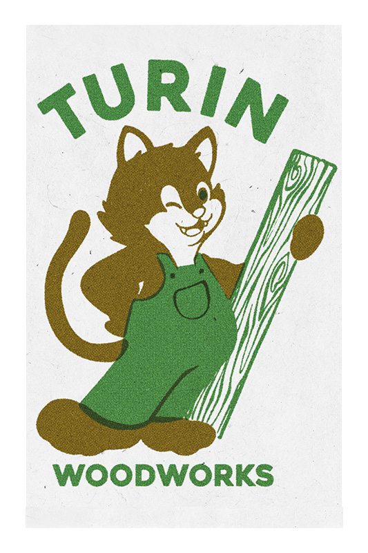
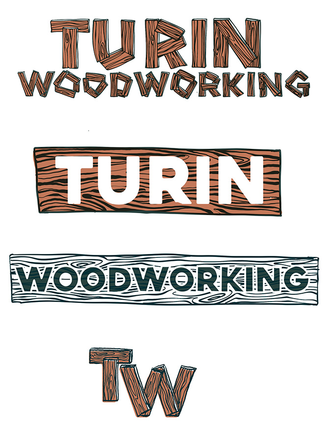
Turin Woodworks
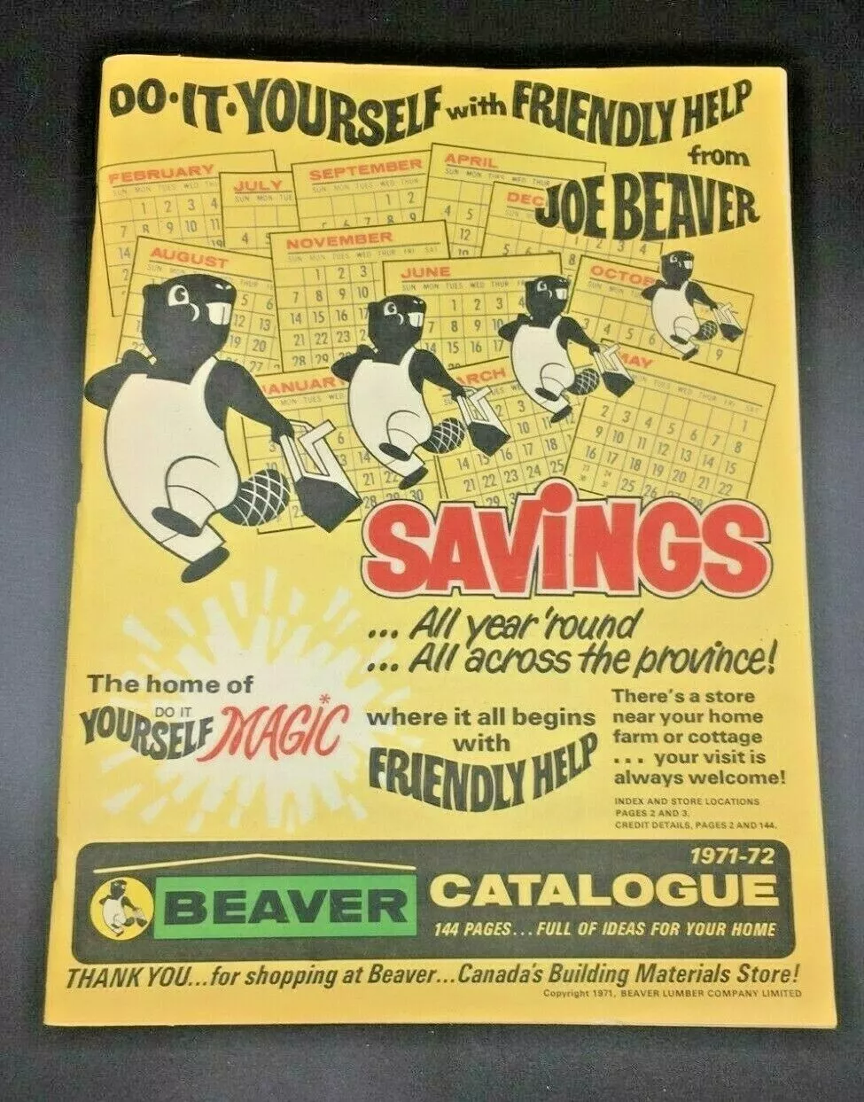
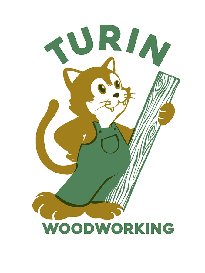
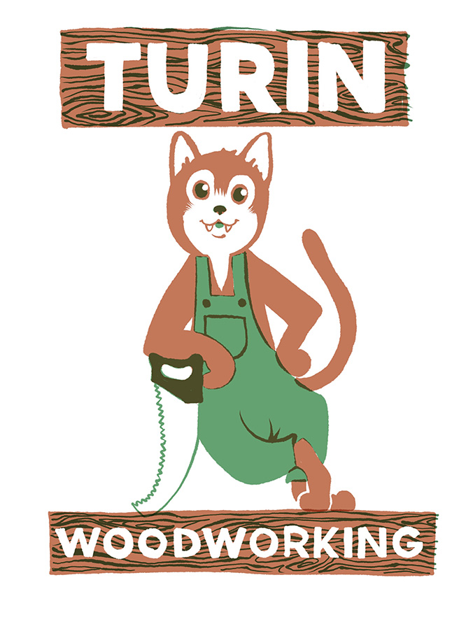
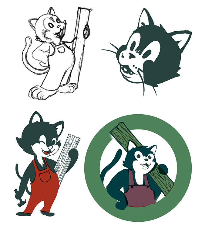
Turin Woodworks needed to put a face to their name. A cat face. They asked specifically for something like the Beaver Lumber mascot and were clear about including overalls and the colour green. Absolutely painless process.
Hotline Tattoo
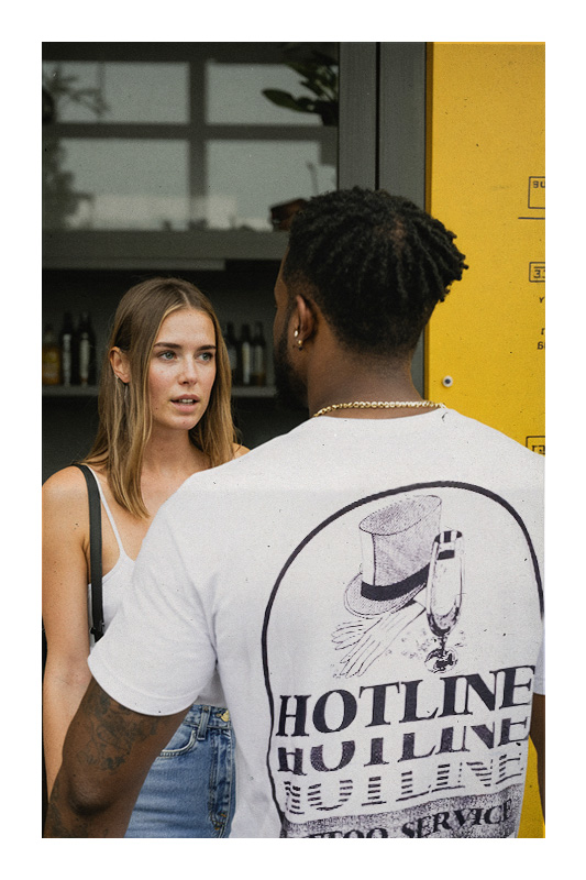
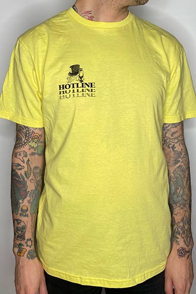
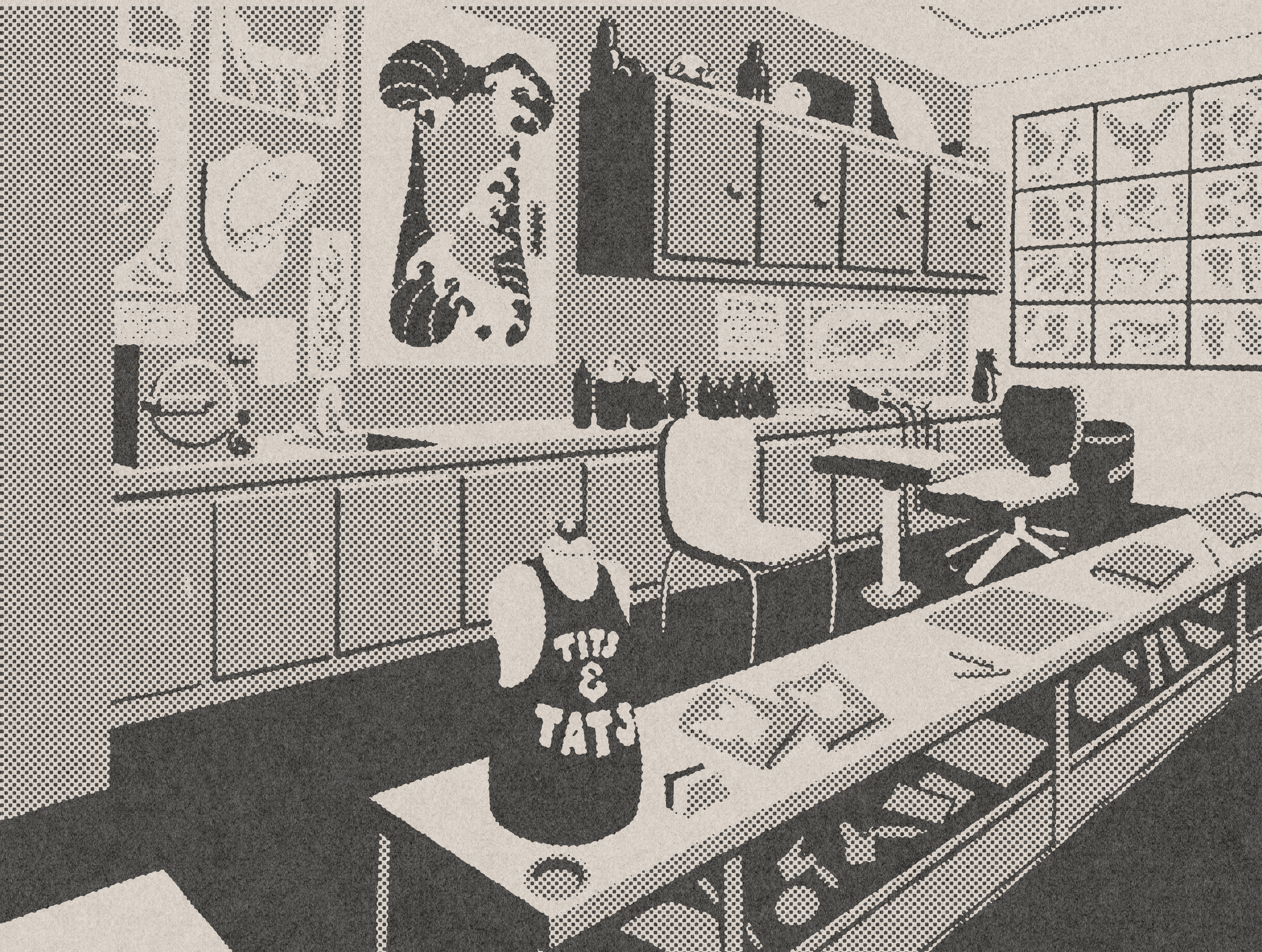
Hotline Tattoo was my shop. It was a 600 sq. ft. wood paneled barbershop from the late 1970's and it was important to me to preserve everything I could when I took it over. Everything I made for Hotline needed to fit that feeling. I spent a lot of time photographing the yellowpages at the Toronto reference library to pull inspiration for the designs and it ended up becoming a source I have gone back to over and over.
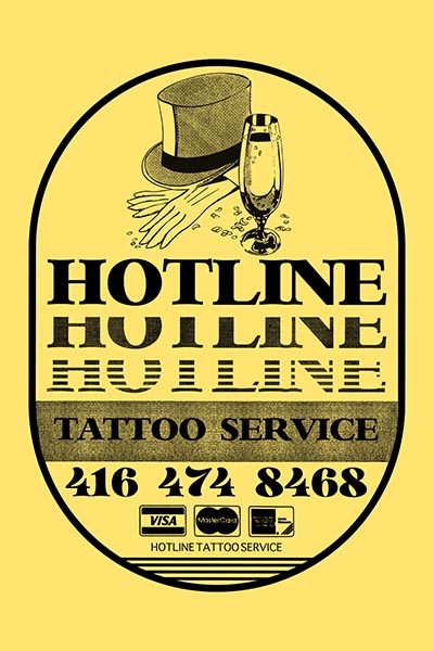
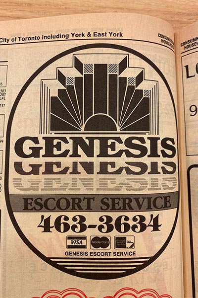
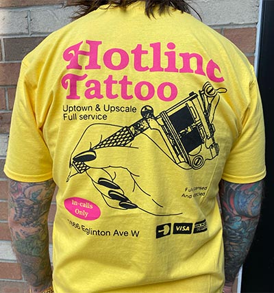
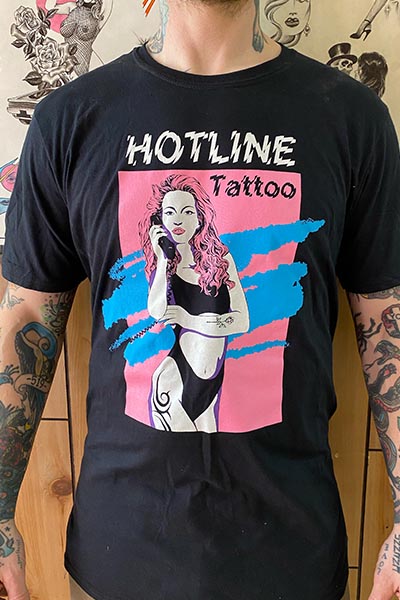
Every city has it's own inescapable low budget tv pitch man. Here in Toronto we have Russel "The Cash Man" Oliver, In Buffalo it was the Lockport Gambino Ford crew (Hi Mom!), If you were partially raised by your TV you know these men like your own uncles. Having my own shop meant I was finally free to become an uncle to the next generation of brain damaged children. These were filmed on VHS and I am one of the backup singers in the jingle.
Needles and Pens Magazine
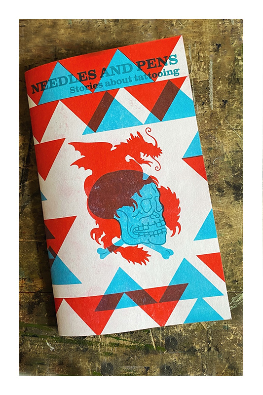
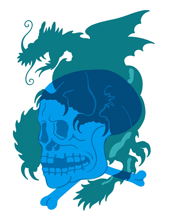
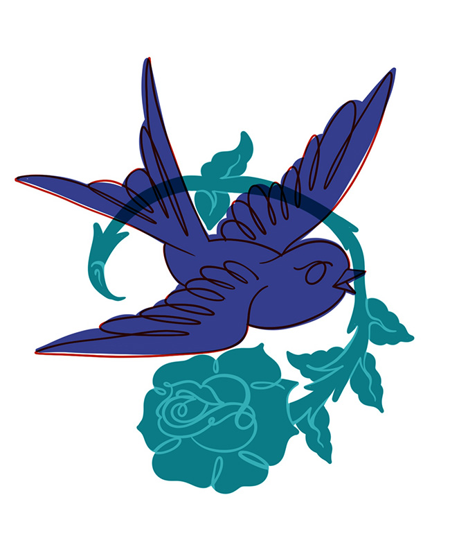
Needles and Pens is a 'zine that I put out with author/tattooist Chris MacDonald. We're both from the same era of tattooing; when it was populated by larger than life characters with stories to tell and we both felt that it was a worthy endeavour to get some of them to paper before it's too late. The 'zine is printed on a risograph machine which gives the cover beautiful natural texture and transparency that allows for great overlay effects between colours. I did some of the illustrating, as well as curated a selection of photographs for the articles.
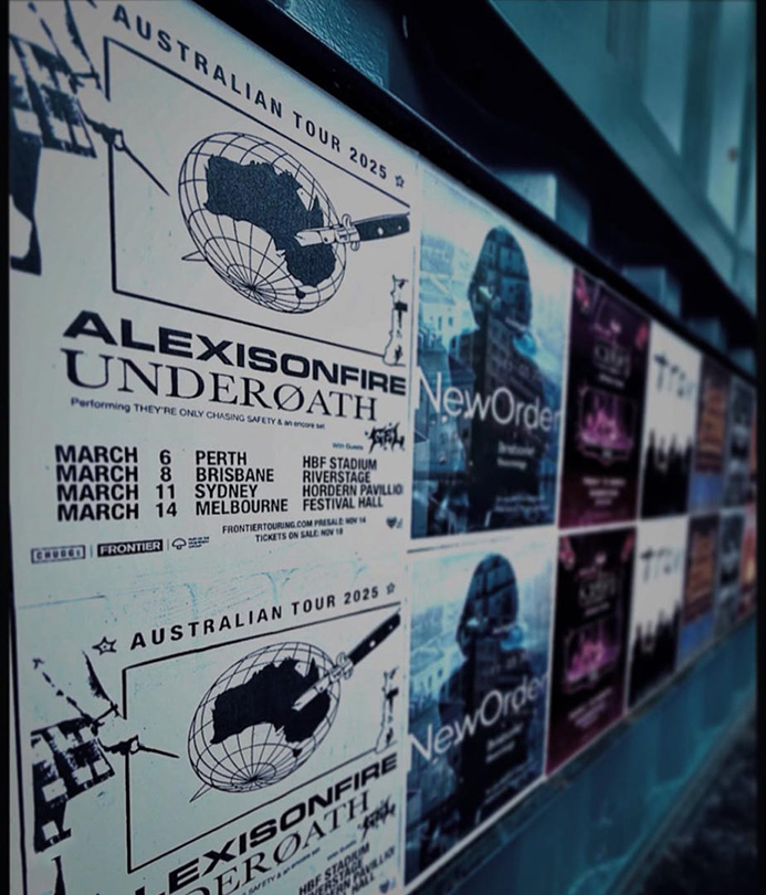
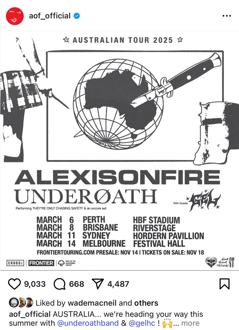
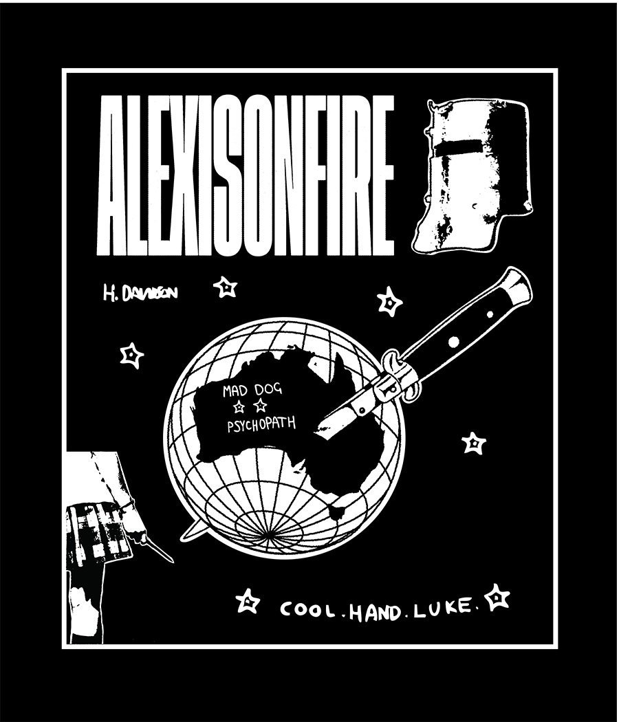
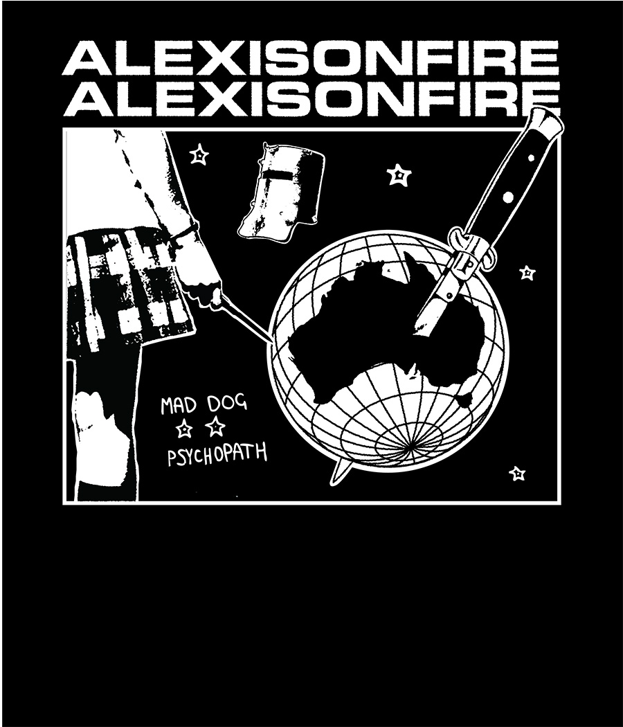
Alexisonfire
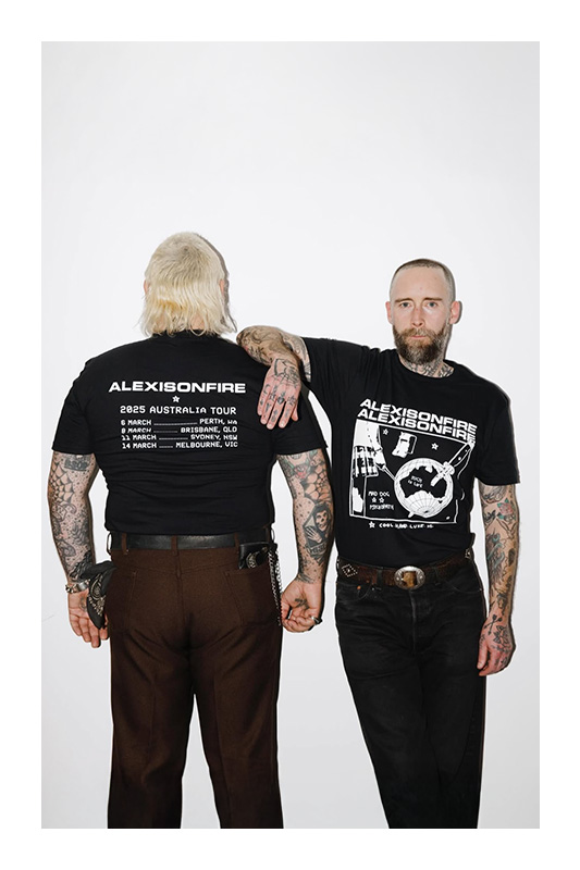
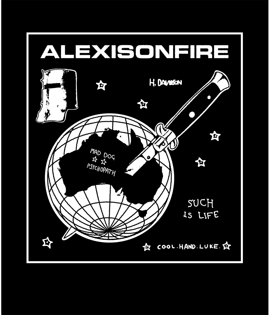
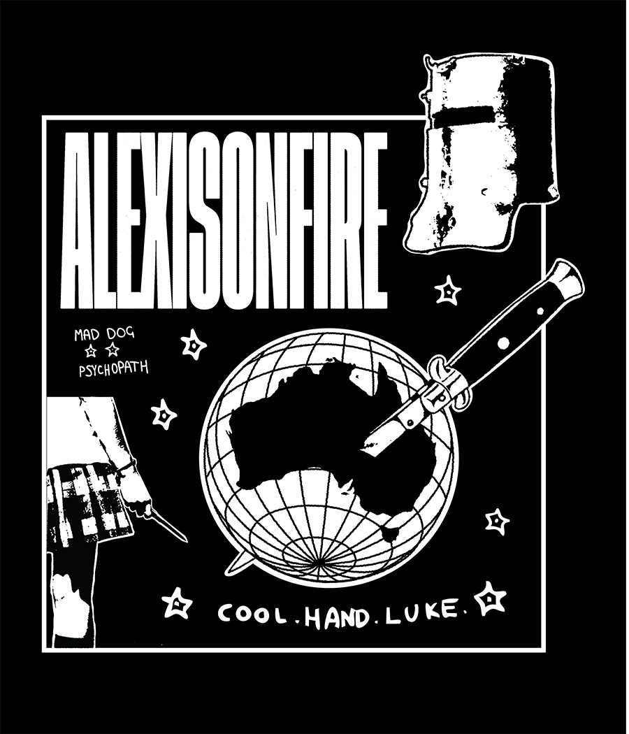
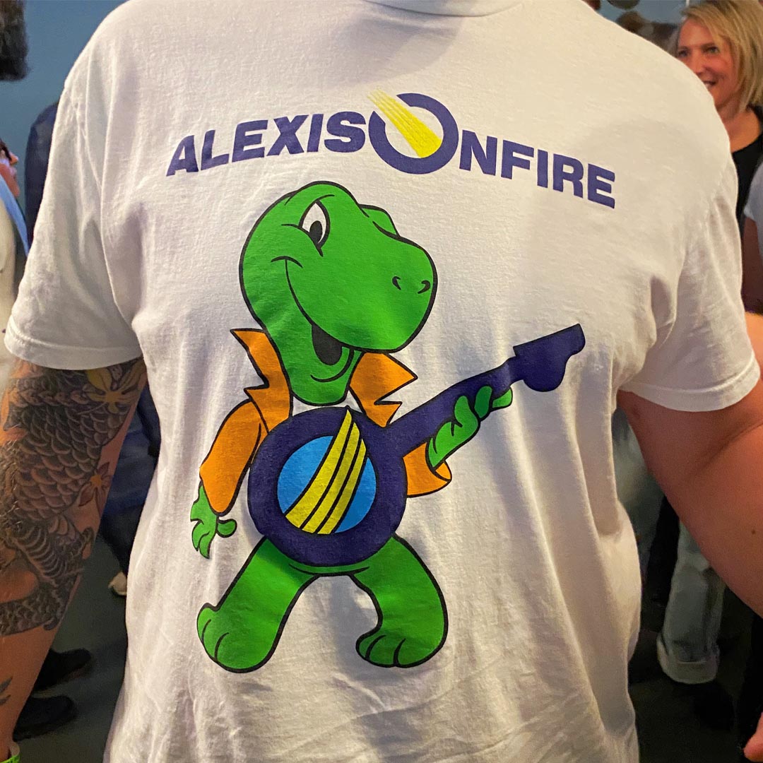
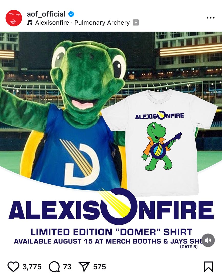
Every band that survives more than one tour learns quickly that they aren't musicians so much as they are traveling t-shirt salesmen with a great gimmick. Nobody gets into it because they want to hustle merch, but if they want to stay fed and keep gas in the van it becomes a vital necessity. Alexisonfire is one of a few bands I work with regularly to prepare for tours with merchandise and promotion.
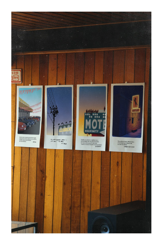
Principles of Design
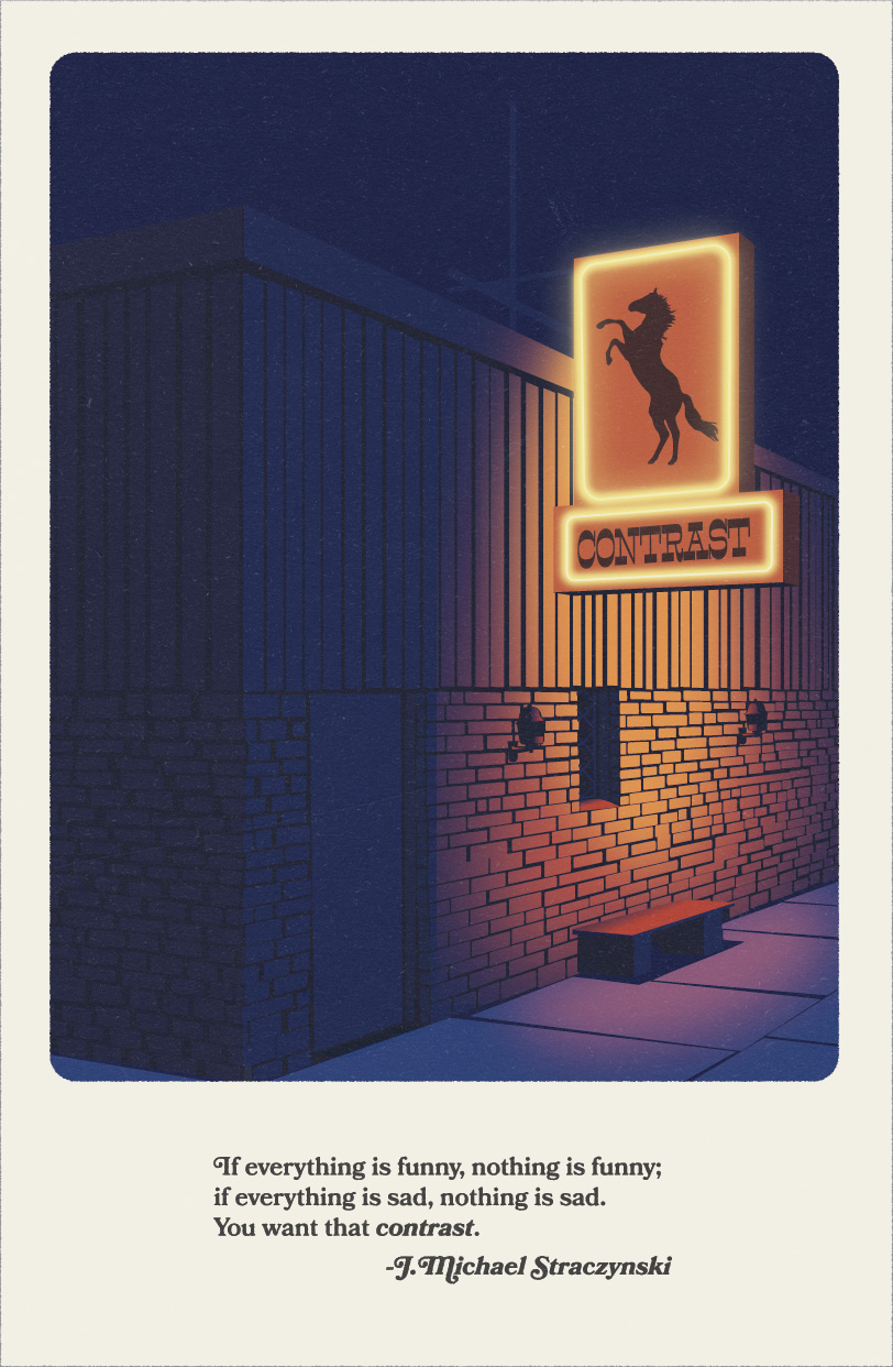
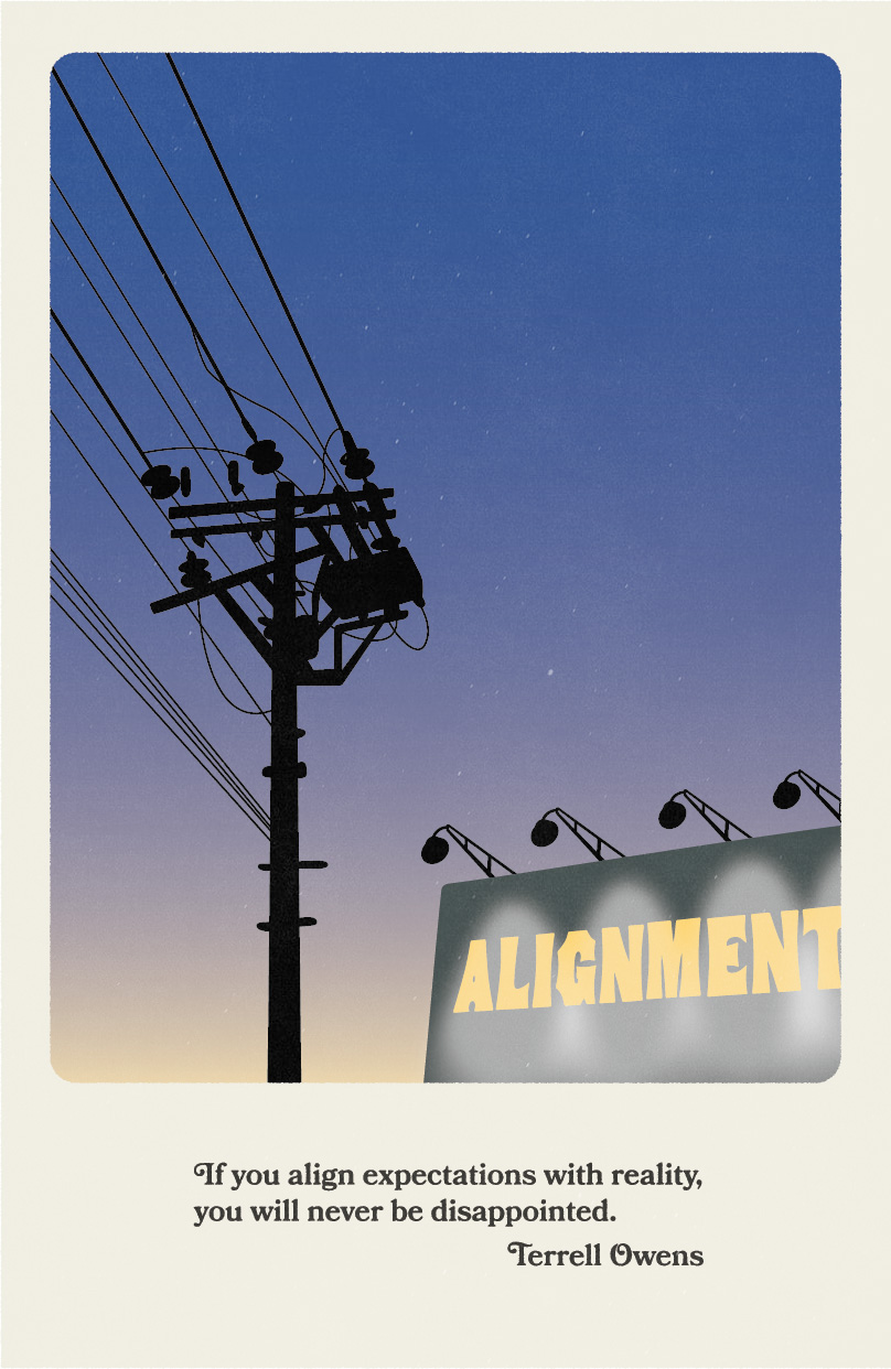
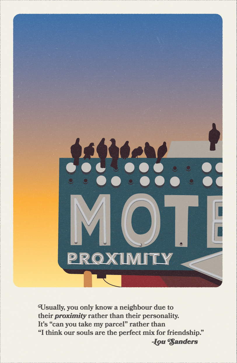
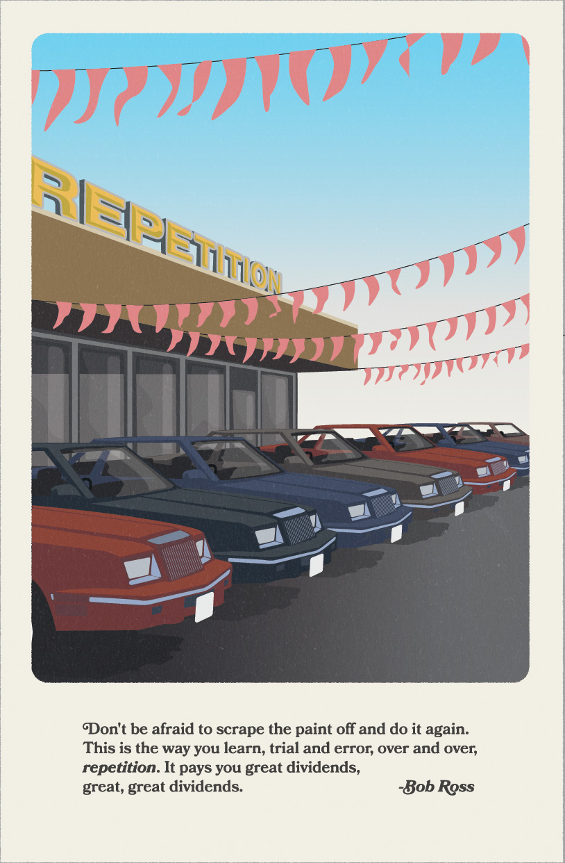
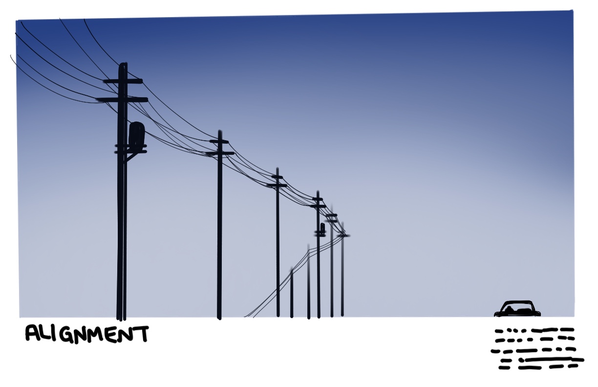
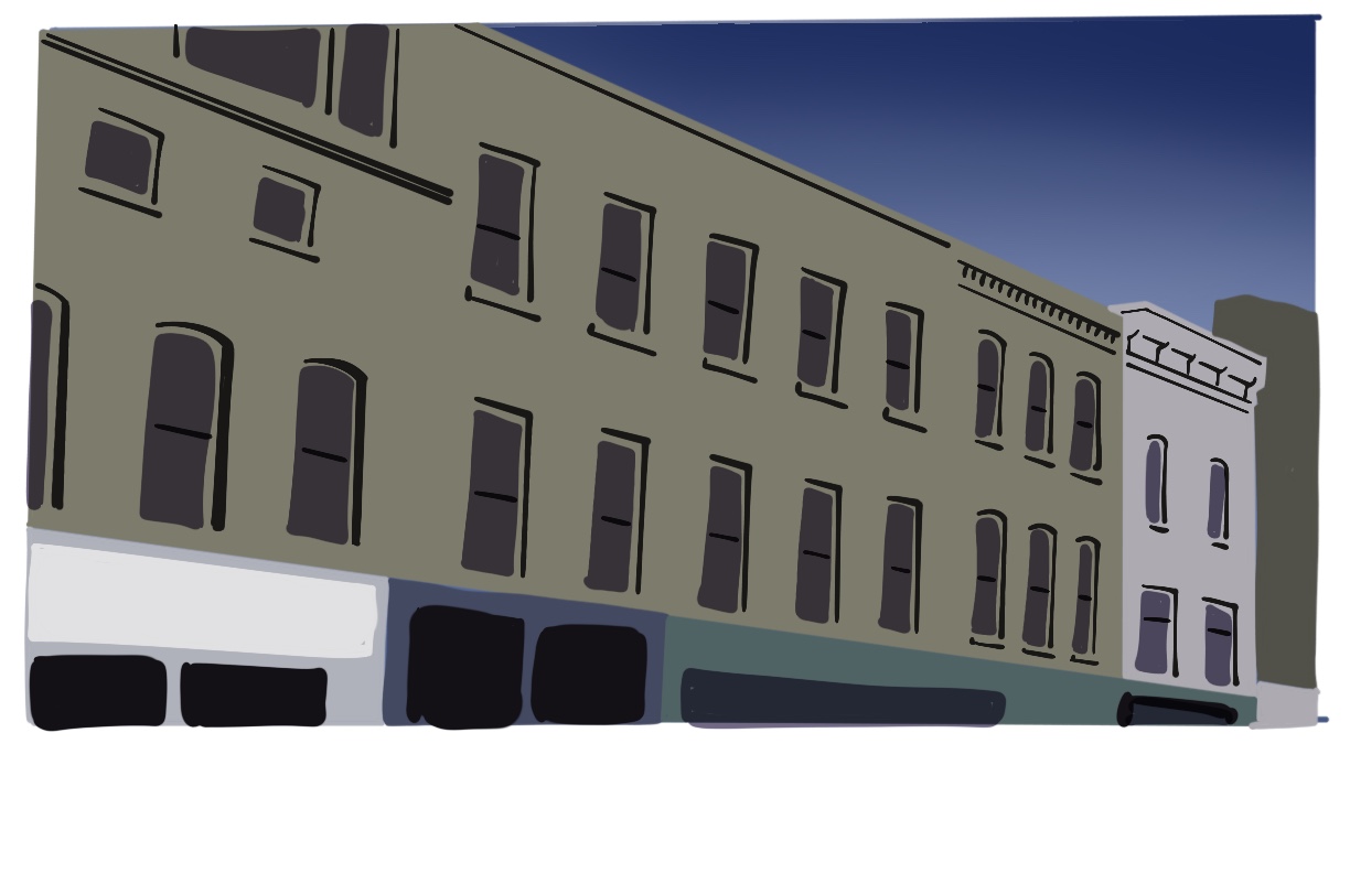
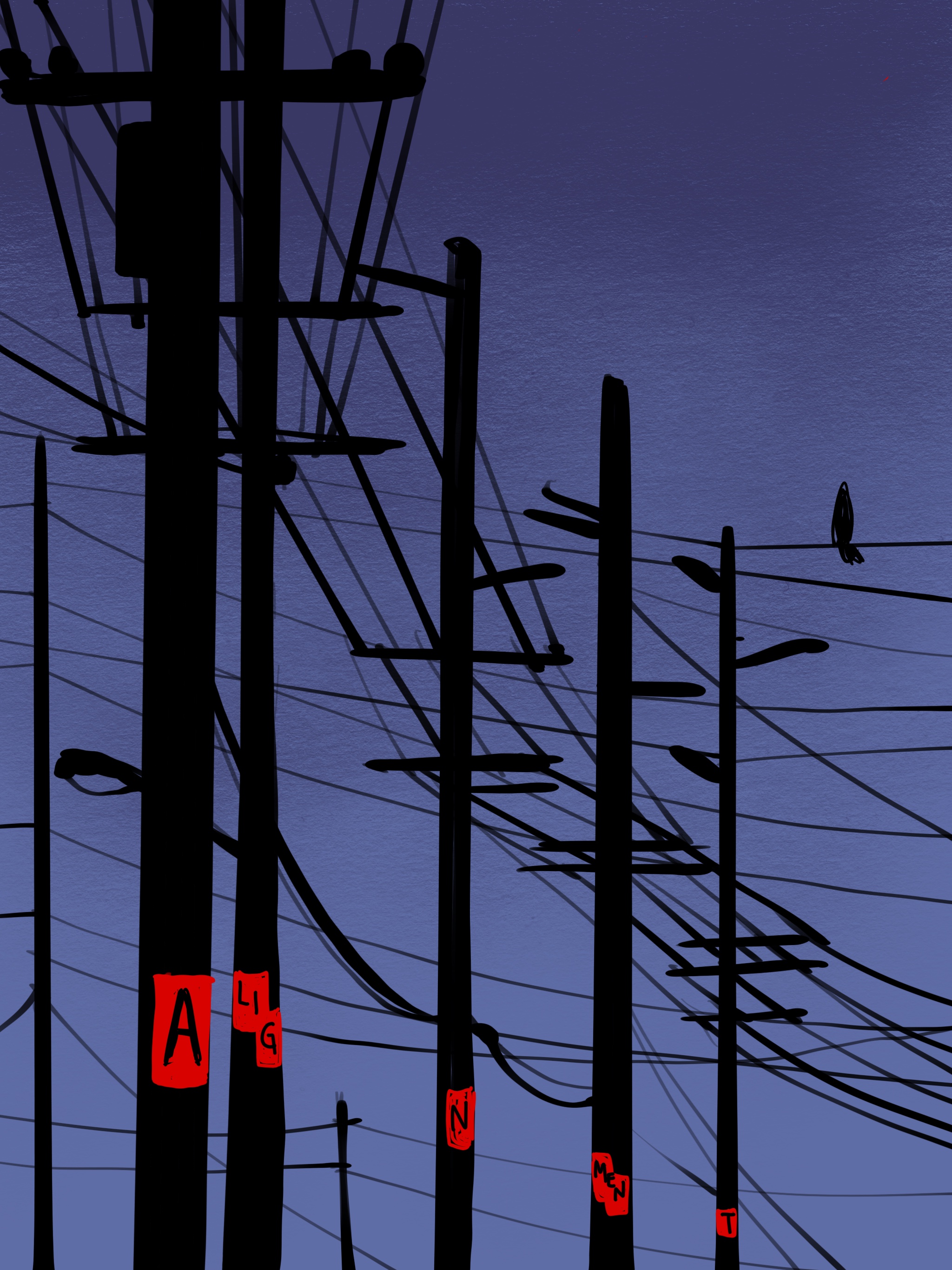
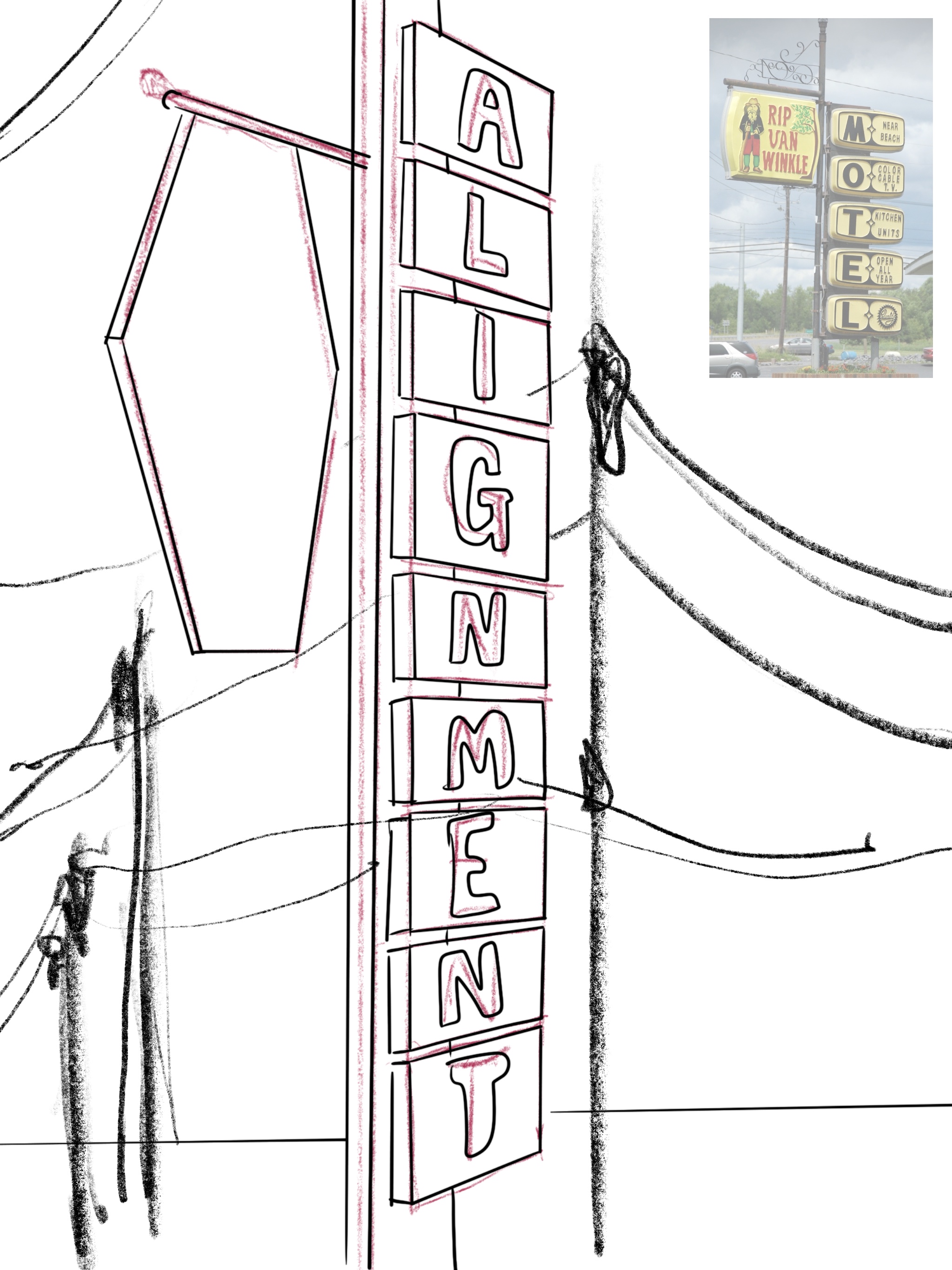
Going to college for the first time as a 43 year old is an interesting experience. Under different circumstances I can't imagine taking the time to explore any project that I wasn't immediately trying to monetize. I'm glad it took me so long to get to school, there is a zero percent chance I would have appreciated something like this at 19 years old. These posters are meant to be a demonstration of design principles as captured in the un-designed world beyond our screens. Some of these required more iteration than others before I arrived on the final versions.

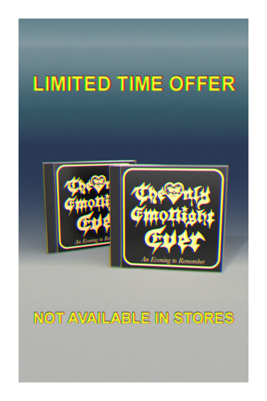
The Only Emo Night Ever
Juno award winning Professional DJ and Alexisonfire guitarist Wade MacNeil puts his pants on like everyone else. When he promotes his tours, however, I help him put on his DJ pants before he hits the road. I filmed some of this on an s-vhs camera and converted it for editing. These videos have been among his most liked and commented on posts on instagram.
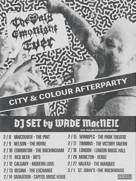
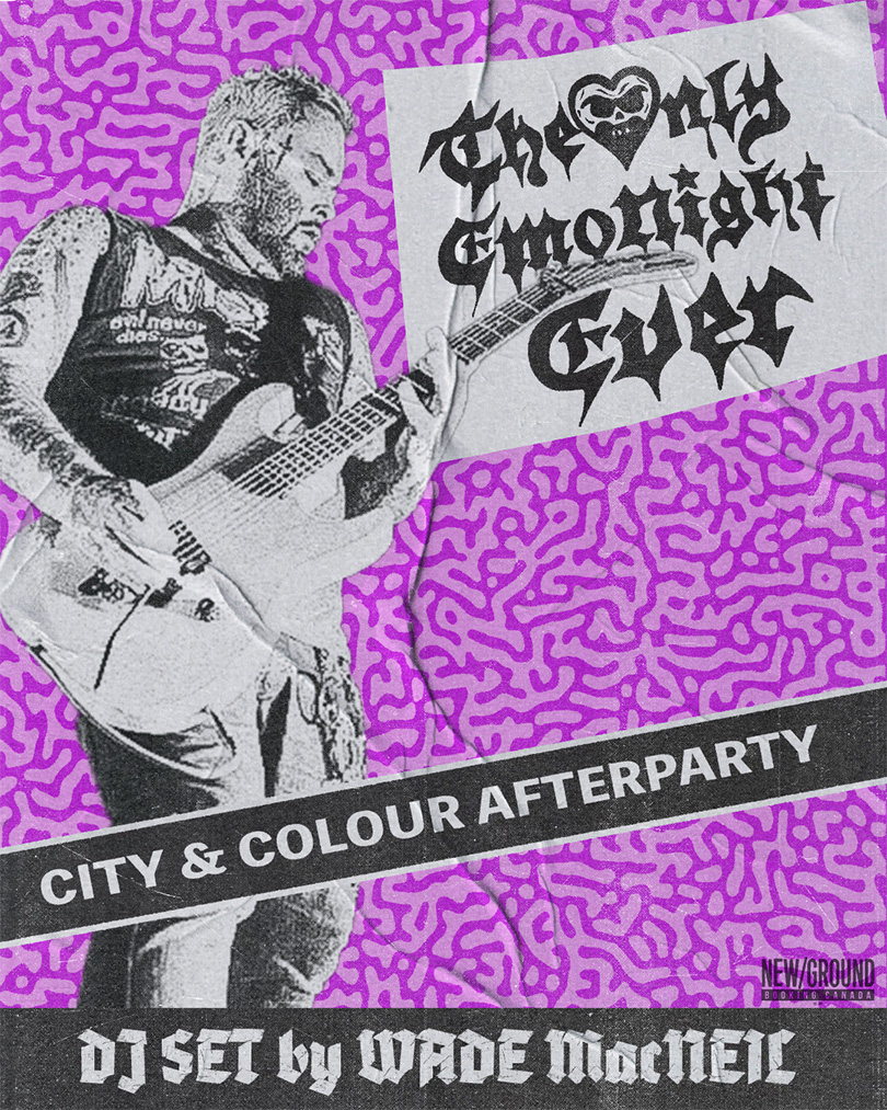
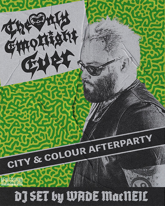
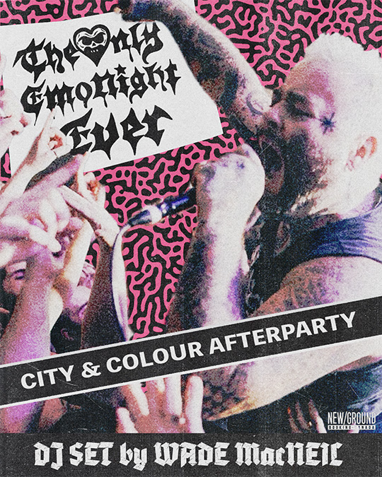
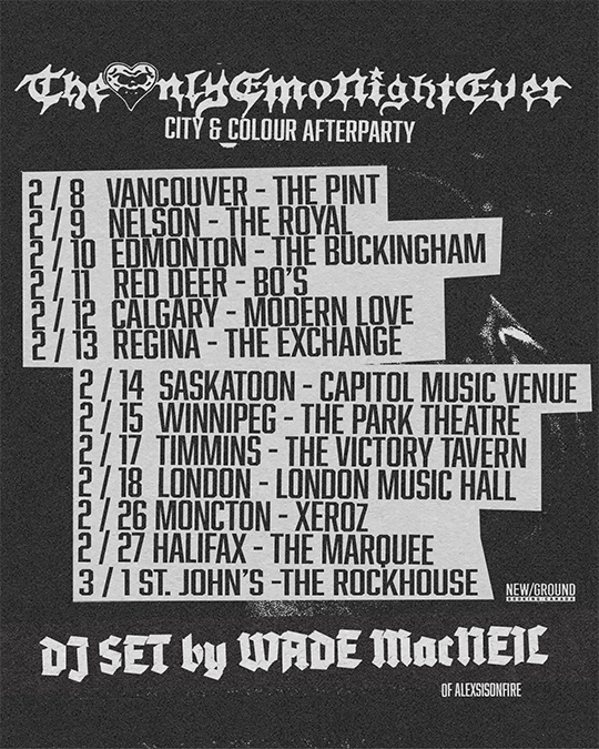
I find that static graphics meant for the screen can feel a little lifeless, so I'm usually reaching for some texture to lend some presence to anything that purely lives online. Similarily with video, if it's meant to have an analog feel, getting the motion graphics to pair well with the video can be a challenge.
